General Guidelines
Illustrations must not require any modifications. Please contact your editor or your editorial assistant if you have any questions regarding the art; submit a sample (or samples) of your art to him/her at your earliest convenience (include these on your disk with the test files). He/she will have it evaluated by an illustration specialist.
The author is responsible for style continuity and consistency throughout the book’s illustrations. If your art contains labels, make sure that the font is uniform throughout the book in size and style. Note: the maximum art dimensions for most of our books (those that are 6.125 × 9.25 inches) are 5 × 7 in. (12.7 × 17.8cm), and most of the art should be the text column width of 4.56 in. (11.5cm). The target font size is 7–9 pts at final art size. We recommend using a common sans-serif font for labels. (Note that labels consist of wording that is part of the figure, as distinguished from the caption/credit, which is typeset close to, usually below, the figure.) Check with your editor regarding your book’s trim size.
Files created in professional graphic applications produce the best results. For more information see the TIF and EPS guidelines below. If you use a professional artist or a contributor to create or scan art, please familiarize them with PUP guidelines before they begin work.
Do not use art from the Internet: for the most part, web art resolution and/or quality are too low for our requirements.
If you are scanning existing art, use scans of original photos and drawings instead of scanning illustrations containing color or gray tones from books and magazines. “Re-reproducing” such art leads to poor quality figures; see the illustration below.
Effects of reproducing from books
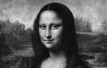
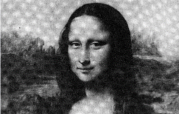
Line art consists of black and white without any intermediate shades of gray, unlike grayscale art; see the samples below. Unlike art containing color or gray tones, line art scanned from books and other print publications can be reproduced without noticeable quality loss.

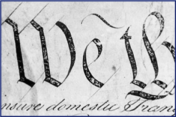
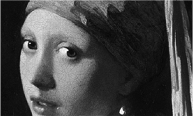
If all the figures are to appear in your book in black-and-white, make sure that your art does not contain any color. If your book is supposed to have color art, please contact the PUP illustration specialist through your editor or your editorial assistant.
Art Formats
Digital art can be saved in either EPS or TIF format. EPS format is best suited for charts, maps, diagrams, etc.; TIF format is used primarily for photographs, paintings, and other continuous-tone images.
EPS Format
EPS format is best suited for charts, maps, diagrams and other graphics that require high precision; it is capable of preserving text that can be edited. EPS is a resolution-independent format; that is, it will print at the optimal resolution of the printing device, and, unlike TIF, an EPS graphic can be scaled up or down infinitely without losing quality.
- The required EPS format should be “vector-based” and not “pixel-based.” Pixel-based EPS format is similar to TIF and does not have the EPS advantages noted above.
- EPS files created in Adobe Illustrator are preferred (version 8 or later). Programs like FreeHand, CorelDraw, and others can also generate acceptable EPS files. Please send PUP preliminary samples for review.
- EPS files need to be in CMYK (not RGB) color mode. Make sure the color palette is limited to white, black, and shades of gray. Pantone, CMYK, and any custom colors should be converted to black-and-white palette. In the saving dialogue, select:
- • EPS for PC (with TIF preview);
- • Include fonts: PostScript (Type 1) or OpenType; do not sure TrueType;
- • CMYK Postscript.
- Delete masked or hidden elements (e.g., lines, type, stray anchor points) that extend beyond the image area (as in figure seen here). Check if your EPS has any masked elements by using “Select All” command.
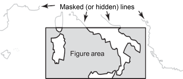
5. If you prefer not to embed the fonts, make sure to convert all the fonts to outlines (or curves). The fonts will no longer be editable as text; however, any font incompatibility problems will be eliminated.
TIF Format
TIF is well suited for reproducing photographs, paintings, and other continuous-tone images in grayscale (or color).
- If you must scan the originals yourself, please try to use a service bureau or a graphics professional. Scan halftone images in grayscale mode (256 shades of gray) such that they will be 300 dpi at the final size of the image. Scan line images in bitmap mode such that they will be 1,200 dpi at the final size of the image. Do not use scans at lower than recommended resolution and/or size. Crop empty space around images and/or irrelevant parts of images.
- The requirements for digital camera photographs are the same as for other grayscale (or color) scans.
- Scans that are significantly higher than recommended resolution or size are acceptable; however, the file sizes will be unnecessarily large, making them difficult for you to work with.
- TIF files are usually created in Adobe Photoshop which is the program of choice for working with grayscale illustrations. However, if your illustration needs to combine grayscale elements with labels, leader lines, or charts, you will need to place the TIF file into a program like Adobe Illustrator to produce an EPS file. (See the EPS guidelines above.)
General Tips for Art Preparation
The minimum recommended line thickness is 0.4 point at the reproduction size of the illustration. Never use hairline rules. If you prepare illustrations larger than they will appeaer in the book, please keep the reduction ration in mind when selecting line weights.
Chart Elements Line Samples Size when printed Grid lines and tick marks 
0.5 point Y and X axes 
0.75 point Graph curves 
1.0-2.0 points - Wide graphs will need to be either reduced to a very small size or turned sideways on the page. If at all possible, please reorganize the data, keeping in mind that the vertical dimensions are much greater than the horizontal. Try not to overload any one chart or diagram with too much data: an overloaded chart is likely to be incomprehensible, especially when reduced to final reproduction size. Consider breaking up a chart into separate parts.
- Keys should be placed within or below the chart or map. Please ensure that tone or pattern samples are large enough to be read clearly. Separate tints by at least 20% (see below). Shades tend to get darker in reproduction, so please use percentages lower than 80%. However, in general, we prefer simple line patterns (see below) rather than tints.


- Consider moving lengthy labels into captions. Graph title, source, and credit line are not part of the figure; they are part of the caption.
- Use boldface selectively for emphasis. Avoid using all caps for labels or varying the font size. Font sizes should be consistent throughout the book’s illustrations, with no more than a 15% difference between the sizes.
- Labels and fine lines reproduce poorly in grayscale. The samples below were scanned from various books at x5 magnification.


Desktop printouts do not always precisely represent the printing press output. The labels and fine lines in high-resolution grayscale TIFs, as well as JPGs, PICTs, and other pixel-based formats, can look very sharp in desktop printouts; however, this sharpness is lost in printing press output (A). EPS provides the optimum quality because it is resolution independent (C).
Tips on Creating Charts
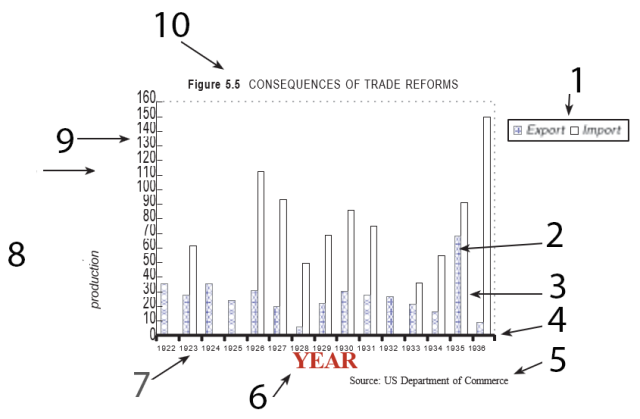
The above chart depicts some of the problems commonly encountered in charts and other graphics submitted by authors.
- Bad key placement, inconsistent font style, spaced too close.
- Line weight is too light.
- Complex pattern should be avoided; color should not be used.
- The line is gray instead of black.; line weight - too heavy.
- Source line and/or note belongs in caption.
- Set too close to the numbers; inconsistent type size (too large); wrong case - initial cap only; color should not be used (in this case omit: information is redundant).
- Type size - too small, should be around 7 - 9 point at the final size of the figure. Spaced too close together: reduce the amount of data or angle the numbers along the X axis.
- Inconsistent font; too distant from the chart; poorly centered; the initial letter should be capitalized.
- Unit of measure not supplied; numbers are set too close to each other and to the axis; the font is distorted.
- Figure number and title are not part of the figure; they belong in the caption.
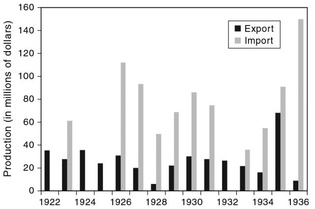
- The chart shown below illustrates how the problems may be resolved.
Tips on Creating Maps
MAP A
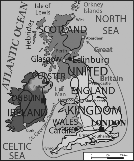
Map A shows some of the typical problems encountered in maps; map B illustrates how the problems may be resolved.
MAP B
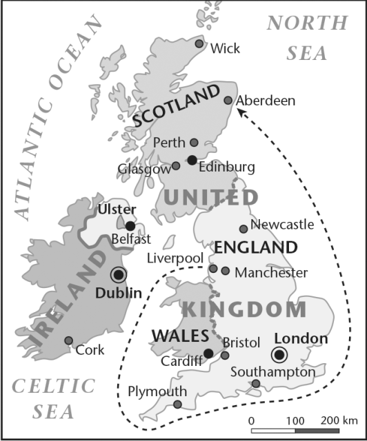
- Keep the labels large enough to be legible; do not use either very small or very large type.
- Do not include irrelevant data in the maps to avoid overcrowding.
- Keep in mind that the color geographic elevation scales are unclear in black and white.
- Use gray tones sparingly and keep them light.
- Avoid setting gray labels.
Alt Text
PUP is committed to making our content in all formats as accessible as possible to the widest possible audience, including people with print disabilities. Providing alt text for all images in your book will help support this goal. Please refer to our guidelines to learn more about what alt text is, why it’s important, and what we need from you.