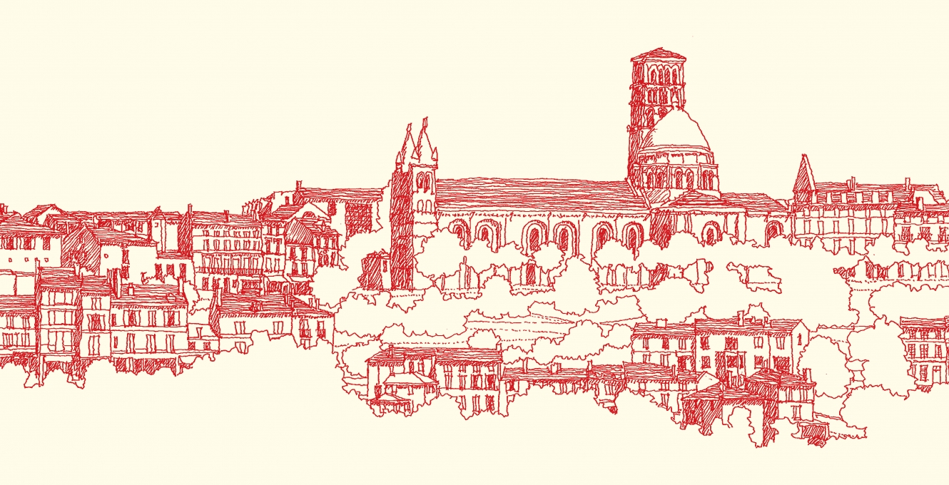
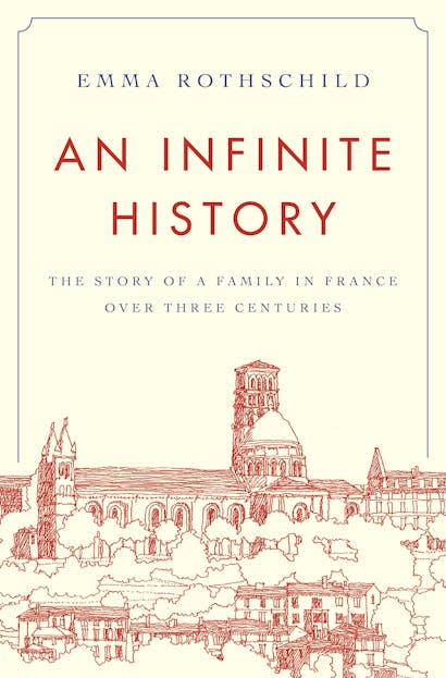
Emma Rothschild’s An Infinite History is a history of infinite possibilities. The book traces the fortunes of a single family and its descendants across space and time, beginning with an ordinary, illiterate woman—Marie Aymard—in an ordinary, provincial part of France—Angoulême—in a time that was drifting towards political revolution and economic transformation. Drawing on a wealth of archival evidence, Rothschild pieces together the disparate lives of the Aymards, through their records and those of hundreds of others, discovering the remarkable ways in which one family’s history is interwoven with a nation’s history, and how, in a real sense, there is no end to the stories that historians can tell.
To learn more about the book’s design and packaging, I spoke with architect Sean O’Rourke and book designer Karl Spurzem.
Sean O’Rourke
Sean, you’re an architect by profession. What was it like being involved in a book design project? What mental shifts did you have to make?
SO’R: I had been involved with a couple of books before, but I never contributed artwork for a cover, so that was new for me. As an architect, I’m used to leading projects and teams to satisfy clients’ expectations, but as a cover illustrator, I was providing a specific piece of artwork in support of a collective vision. When I sketch for myself—no matter what it is—I don’t feel any pressure or external obligation. But in this case, there was a little pressure. I would ask myself: Am I doing what they want? Is this what they expect?
I think those questions have been laid to rest! How did the idea of drawing the townscape of Angoulême come about?
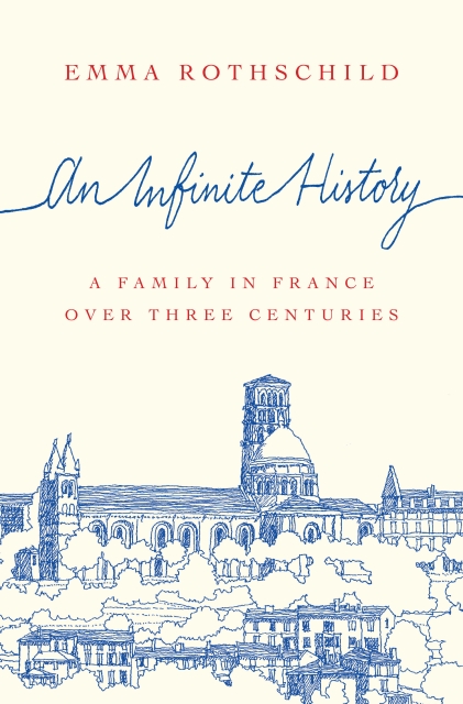
SO’R: Maria Lindenfeldar [Creative Director of the Press] reached out to me. She was familiar with my work and thought that one of my sketches could be an integral part of the book jacket. I sent in a few examples, and I think everyone felt comfortable giving me a try. Then Maria gave me a rough idea of what she envisioned: a panoramic view of the town. But she didn’t stipulate much more. I was given a free hand, more or less.
What insight did you gain from the book?
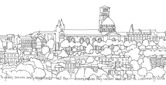
SO’R: I was struck by the notion of place and how it’s embedded in the Aymard family’s history. As someone interested in places, I felt an instant connection. I also began thinking about the relationship between place and writing, and this influenced some of my sketches.
How so?
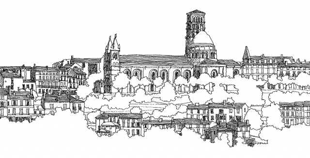
SO’R: In some of them, the linework moves from abstractness (along the edges) to more clarity and detail in the center. This allowed me to incorporate words from the text—the recorded words of Marie Aymard’s grandson [from 1826]: “All the enunciations they contain should be in conformity with the most exact truth.”
That’s quite an emphatic statement.
SO’R: Yes. And it suggests a congruence between a place and its representation.
Or between language and reality.
SO’R: Exactly.
Tell me more about your process of drawing Angoulême. How was it similar (or different) to sketching other locations?
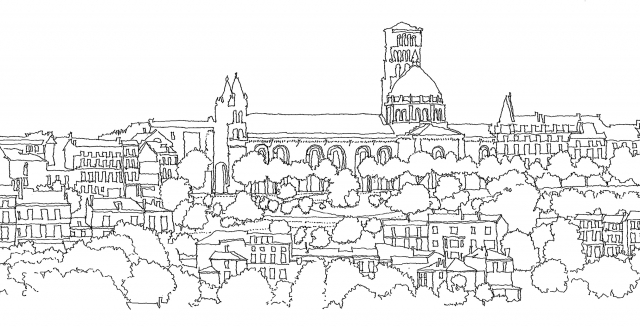
SO’R: When I sketch, it’s almost always on location. There, I’m doing one of either two things: noticing something of significance (usually architectural) and trying to capture it on paper; or sketching something that intrigues me, without any preconceived notions, in order to figure out its value. Over time, I’ve developed a minimalist approach to sketching: just a thin black line with ink pen on paper. I can do it simply and quickly when I travel. I asked permission to travel to Angoulême (jokingly), but the budget wouldn’t allow it, so I had to find a viewpoint that seemed to capture the scale and texture of the town. I built a view from photographs on the web and sketched that view a couple of times using poché [a technique for rendering the thickness of walls and floors in an architectural plan] and line.
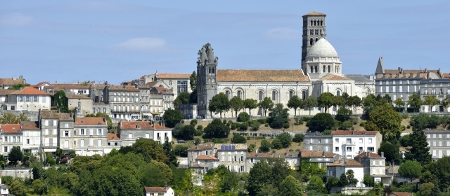
A view of Angoulême from both photographs and the book.
SO’R: That’s right. I was always going to look at Angoulême from afar, through pictures and words.
Karl Spurzem
Karl, how did the concept for this design originate?
KS: It originated in the story of Angoulême, really, and out of the various records that Emma Rothschild uncovered about the Aymard family. We were inspired by this form of history—of starting with a place and tracking down all the connections to it, as impossible as that seems. And we decided that an image of Angoulême would anchor the design. That’s what led us to Sean. Maria [Lindenfeldar] was familiar with his architectural work and his line drawings of places and buildings. When she showed us his sketches, we knew his style was a perfect fit.
In what way?
KS: Sean’s linework is detailed enough to give you a strong and unique impression of a place. But it also lends itself to the subject of this book. We were looking for a way to evoke the past using incomplete information, and what better visual medium than an architectural sketch? Its provisional quality gave rise to the entire design.
What creative choices were most relevant in illustrating that sense of time unfolding?
KS: With our concept and illustration locked in, the rest of the process was about finding the right style for that sense of time. The story covers two centuries, so it had to be historical without being too specific. It’s not a grand history of great powers and nations; it’s intimate and local, so it had to have a degree of particularity. We tried a couple of versions where the line art connected across the jacket to a handwritten version of the title; but ultimately, those never clicked for us because the hand-lettering felt too modern and out of place.
Tell me about collaborating with Sean and incorporating his work into the composition.
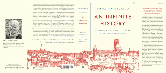
KS: Sean’s a pro, man. He made this easy. His first sketches nailed what we were looking for, so our layout just had to accommodate the artwork. When the cover was final, we provided Sean the dimensions of the book jacket and he filled out the rest. I think we just needed a few additional inches of art to reach the back flap and some of the magpies Sean sketched for the endsheets.
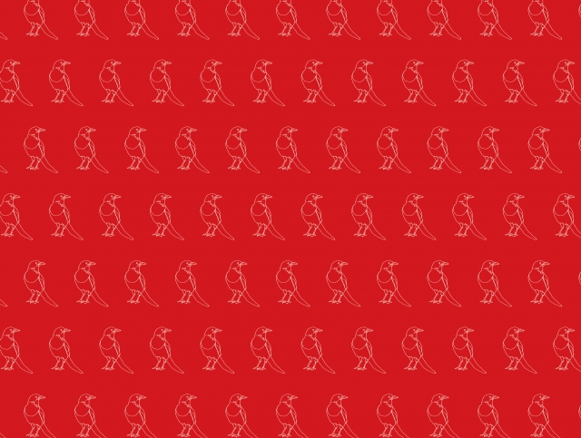
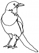
Yes, the magpies!
KS: The magpie is featured once in the book, but it’s a vital symbol of the author’s way of doing history, collecting pieces here and there, always waiting in the wings.
Christopher Lapinski in the Art & Design Coordinator for the Creative Media Lab. Karl Spurzem is a senior designer in the department. Sean O’Rourke is the Vice President and Design Director at Bergmann, an architecture, engineering and planning firm. He lives and works in Philadelphia, PA.
