

A book’s design communicates to readers before the book even has a chance to. It tells us something essential. The most successful book design goes a step further: it compels us to hold the book in our hands for a little while, turn it over, leaf through it, and admire its form. We are spellbound by the cover image, perhaps, or a pattern that wraps around the jacket. We delight in the book’s typography, its texture, the quality of its production. In that short span of time in which we judge books by their covers—before we plumb them for their ideas and wisdom—we learn to cherish them for their craft and artistry as beautiful objects.
The Press’s winning entries in the 2020 Association of University Presses Book, Jacket, and Journal Show meet that standard of excellence. All seven designs articulate their books’ content in novel ways; all have unmistakable aesthetic value. How did they do it? Here, in their own words, the designers of our winning entries elaborate on their process.
Trade Typographic
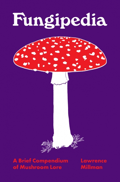
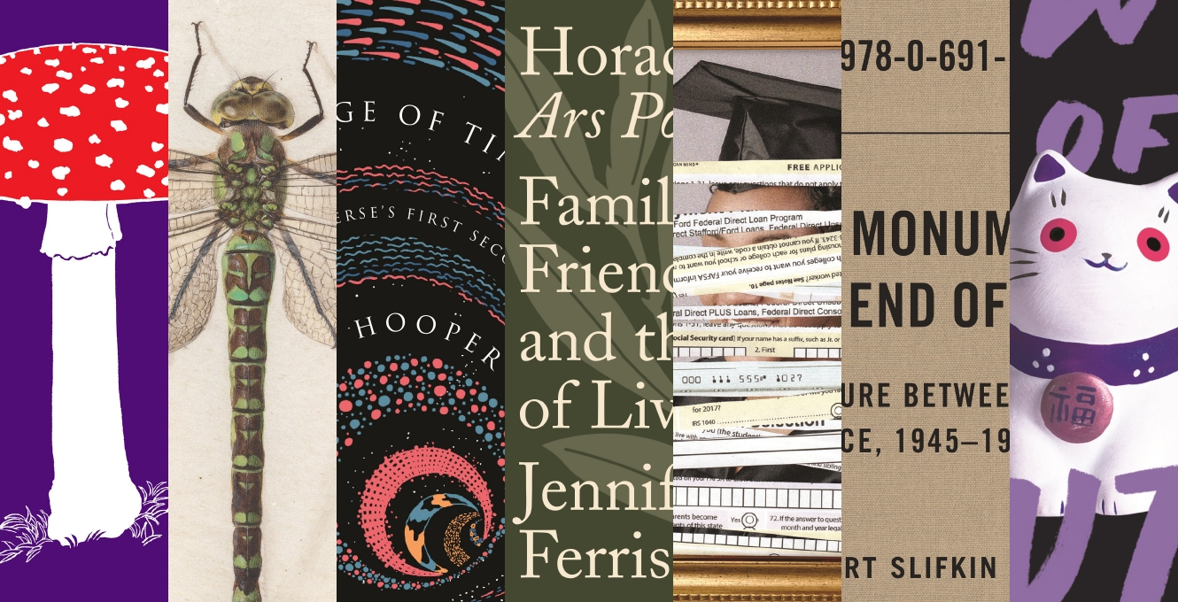
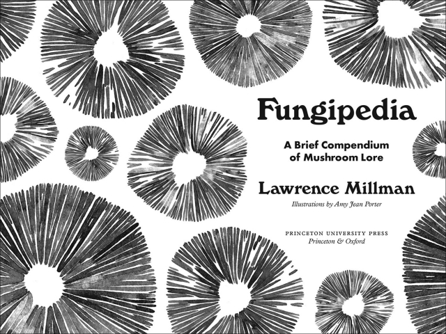
Fungipedia: A Brief Compendium of Mushroom Lore
Author: Lawrence Millman
Illustrator: Amy Jean Porter
Designer: Chris Ferrante
This mini-encyclopedia of fungal lore was a delight to design. While full of serious science, the author’s tone is light and humorous—complemented by Amy Jean Porter’s playful drawings. My goal was to convey that sense of whimsy in every design decision by crafting an overall package that’s fun and inviting. The trim size is small—nearly pocket-size at 4 ½″ × 6 ¾″. For the display typography, I chose Windsor, which has quirky and bulbous letterforms resembling mushroom stalks and caps, the proportions of those letterforms pairing well with Plantin and Futura for the text. The off-white text stock is warm, literary, and comfortable on the eyes for reading. The cover features a lovely illustration of a fly agaric drawn by Amy. The binding materials include a bright (psychedelic!) purple cloth case stamped with red and white gloss pigment foil, bright red endbands, and one-color printed endpapers featuring a decorative pattern of mushroom spore prints.
Scholarly Illustrated
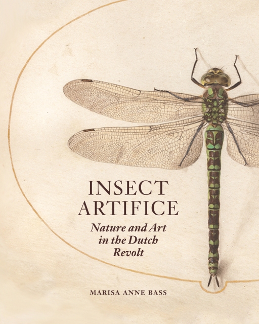
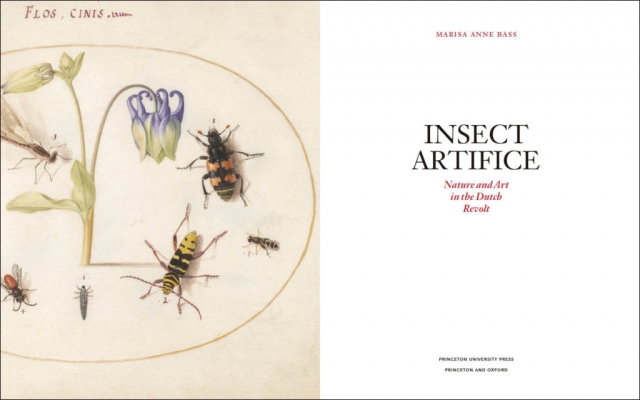
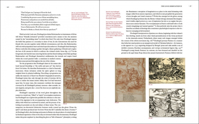
Insect Artifice: Nature and Art in the Dutch Revolt
Author: Marisa Anne Bass
Designer: Jenny Chan
The concept for this book’s cover was inspired by a line in the introduction: “This book is about deceptively small things.” With this notion in mind, we enlarged the cover image to reveal the delicacy of Dutch miniaturist Joris Hoefnagel’s detailed and meticulous work. The text is set in Janson, a seventeenth-century Dutch old-style typeface. In the table of contents and other areas of display type, we referenced a number of typographic particularities and rhythms found in Hoefnagel’s hand-lettering. The textures and coloration of medieval and Renaissance manuscripts, especially the technique of rubrication (adding red to capital letters or other decorations in a manuscript), were all a means of expanding the project’s simple color palette and giving certain parts of the text more emphasis. In determining a suitable trim size, we aimed for a page that would allow the actual-size plates to feel appropriate and balanced while also offering enough room to accommodate the dense text blocks of the essay. For the plates section, we chose a contrasting paper stock with a strong background color to create a distinctly different viewing environment, one that would show the facing pages of the manuscript as they are meant to be seen.
Book Jackets and Covers
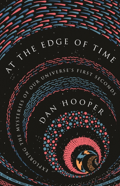
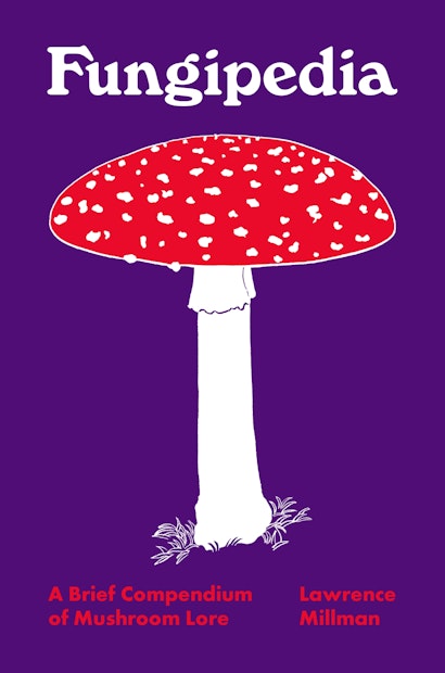
At the Edge of Time: Exploring the Mysteries of Our Universe’s First Seconds
Author: Dan Hooper
Designer: Sukutangan
When we first read the design brief, we were hooked—Dan Hooper’s idea of exploring “the first few fractions of a second of the universe’s history” excited us. We tried to imagine the universe mere seconds after the Big Bang, and how matter and antimatter were fractionated and dispersed before the formation of stars and galaxies. This thought experiment led to a series of sketches, each one an attempt to illustrate our vision. We were also very conscious of avoiding stock graphics on the covers of similar books. Then came the idea of representing expansion. By creating an image of a wave getting bigger and bigger—the unraveling of time—we could show the formation of eons, a symbol of change and growth. When designing the cover, we rendered this image in pink, blue, and orange (such colors are rarely seen together in cosmology books), and we used Trajan Pro for the title, thereby striking a fine balance in this vivid design.
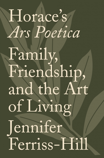
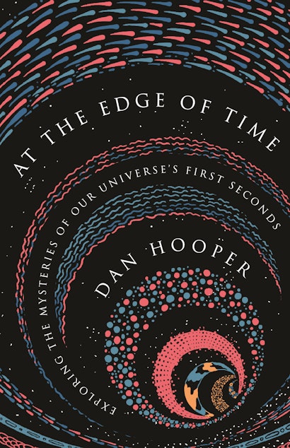
Horace’s Ars Poetica: Family, Friendship, and the Art of Living
Author: Jennifer Ferriss-Hill
Designer: Layla Mac Rory
The concept for this cover design came from ancient Roman imagery. The author wanted the cover to convey the rich history of Horace’s poem while also feeling contemporary and elegant. Therefore, I used an enlarged olive branch as the main image to allude to ancient Rome without being overly literal. Adobe Caslon Pro was my primary typeface to achieve the elegance the author had requested, but I enlarged the type to make it feel more contemporary and also to distinguish it from other books.
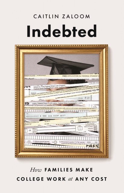
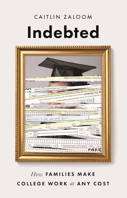
Indebted: How Families Make College Work at Any Cost
Author: Caitlin Zaloom
Designer: Amanda Weiss
According to Caitlin Zaloom, one of the many burdens that college places on students and middle-class families is the obligation to fill out a multitude of financial assistance and loan forms. These forms hold an iron grip over their signees, dictating the terms of their now financially dependent future. This led me to the idea of positioning an array of forms and checks over the stereotypical portrait of a college graduate. Instead of symbolizing hard work and achievement, the portrait now represents the overwhelming stress and disorientation of tuition costs, accruing debt, and mounting paperwork. The frame I chose is not grand, but it’s not cheap either. The shredded forms and checks are ominous, gradually covering and engulfing the portrait. It reminds the viewer that the financial burden is never truly gone; it will follow the college graduate and his/her family well into the future.

The New Monuments and the End of Man: U.S. Sculpture between War and Peace, 1945–1975
Author: Robert Slifkin
Designer: Jeff Wincapaw
The design concept for this cover follows American military field manuals from the 1940s and 1950s. These were distinguished by their sober, no-nonsense style. I used Trade Gothic Bold as an allusion to their clear and serious typography. The dust jacket is printed with black ink on textured Kraft paper, mimicking the softcovers of the original manuals. As a final touch, I added the book’s ISBN near the top, replacing the serial number that identified those early handbooks.

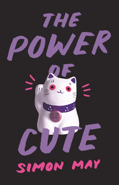
The Power of Cute
Author: Simon May
Designer: Amanda Weiss
The Power of Cute challenges our preconceptions about cuteness, revealing something much darker and uncanny behind conventionally “cute” images. We wanted to convey that uncanniness on the cover: cute on the surface, but strange and off-putting upon closer inspection. In the book, Simon May discusses Japan’s billion-dollar industry of “cute,” focusing on characters like Hello Kitty. This led us to the Maneki-neko, a popular Japanese talisman thought to bring good fortune. It’s cute and fun on the outside, but if you stare at it a little too long, it becomes a bit disturbing. I wanted to make viewers feel that, no matter where they were in a room, the cat would always be staring at them from their bookshelf. To accomplish that, I replaced the figurine’s original red and yellow colors, which were too warm, and increased the size of the pupils just a bit, but not too much. I also isolated the cat from its context, placing it on a dark purple—almost black—background. As a final touch of (ambiguous) cuteness, I added small pink rays, suggesting that the cat is gentle and harmless. For now…
Christopher Lapinski is the design coordinator for the Creative Media Lab.