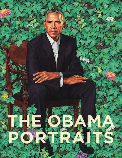
Every book’s backstory includes the intricacies of its production. That fact was brought home to me in my recent discussion with Steve Sears, Production Manager for art books at Princeton University Press, about the design and manufacture of one of the Press’s most important books of 2020, The Obama Portraits. Listening to Steve, I was struck by the level of ingenuity, care, and discernment applied to this book’s crafting. From his point of view, the goal was not only to capture its remarkable subject—Kehinde Wiley’s portrait of Barack Obama and Amy Sherald’s portrait of Michelle Obama in the context of presidential portraiture—but to present these innovative and culturally significant works in a new and beautiful way.
How did you approach the manufacture of such a high-profile book in the Press’s art program?
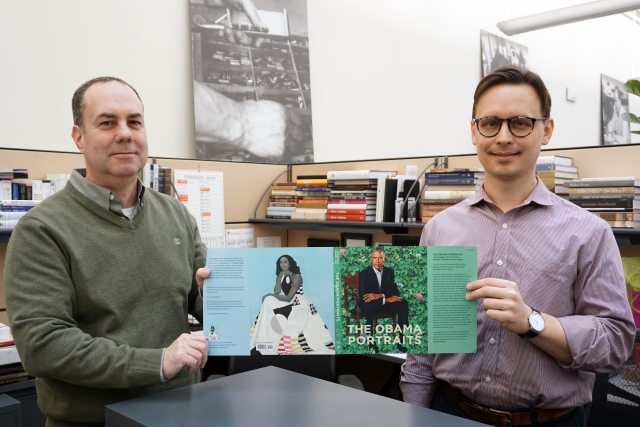
Carefully—but also with a great deal of enthusiasm. As with all book projects, and especially ones of this magnitude, it’s important that all the parts move in concert. For the Portraits, one of the most critical of these was the jacket.
It’s an uncommon book jacket, isn’t it?
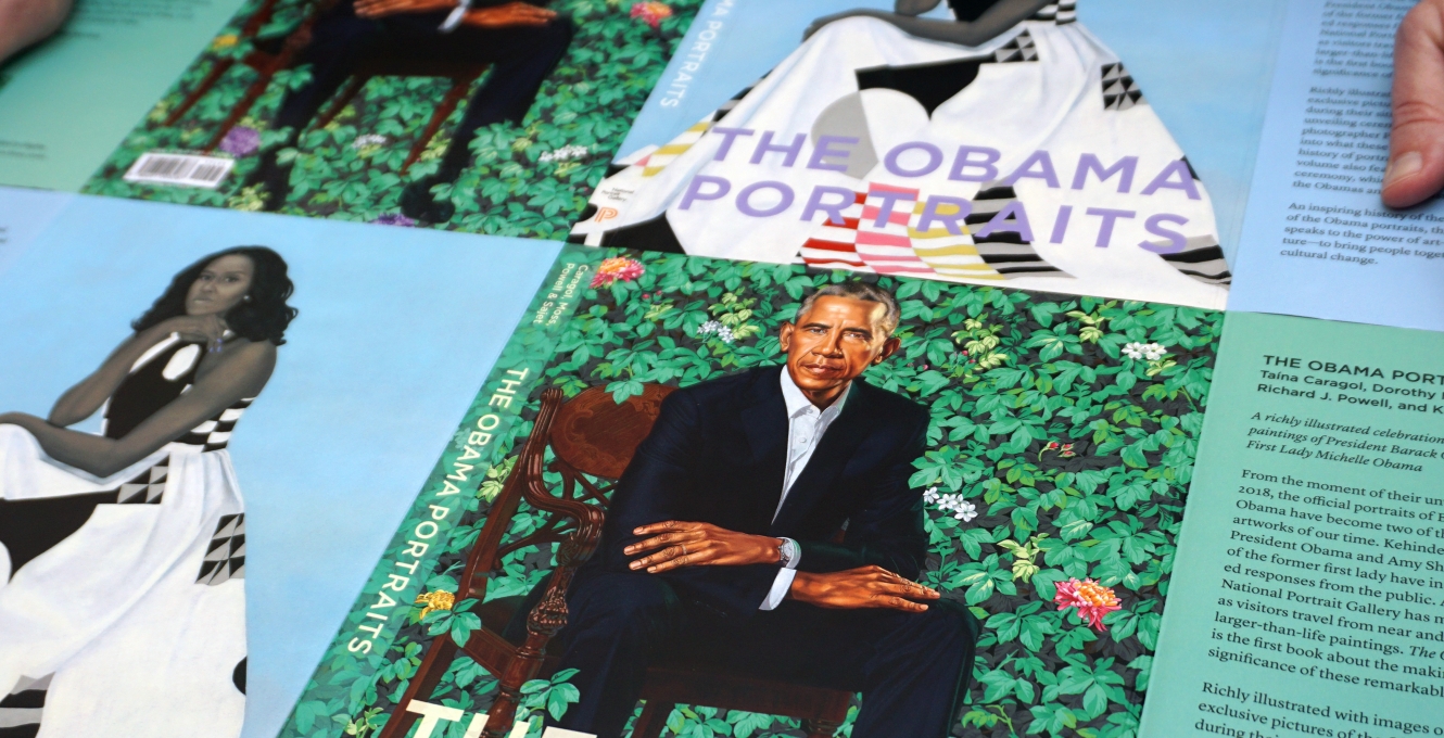
Yes, for good reason. A key challenge was to show both portraits without favoring either one on the front cover. A solution discussed early on was to make the jacket reversible. In this way, there would be two jackets in one, allowing readers to tailor it to their own preference by flipping it, and therefore interchanging the portraits seen on the front and back covers.
Who designed it?
Miko McGinty. We chose Miko for her expertise in museum publications. She’s a pro at them, and just an excellent designer, in general. We talked with her about our design scheme for this book’s jacket, and she embarked on it with a lot of confidence and flair. You can see it in how she lavished the covers with full-bleed images of the portraits.
She also skillfully integrates type and color.
Exactly. The book’s title is projected in Gotham typeface—a transparent yellow on Barack’s side, a pale purple on Michelle’s. Also, the color of the jacket flaps complements each portrait’s background palette, which creates a clear sense of continuity. In its finished state, Miko’s design brilliantly evokes the different personalities of the Obama portraits.
Getting the jacket right was one crucial part of the production process. There’s also the text and layout of the book.
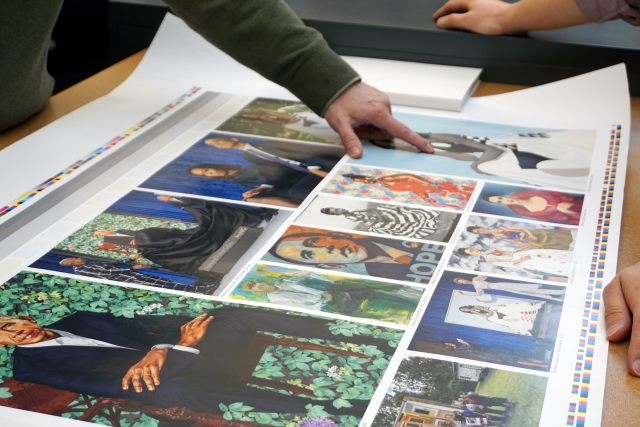
Right. These are equally important elements in any book’s production. Once the text and layout are stabilized (meaning that the manuscript has undergone final editing and the layout is approved), serious attention turns to the proofing of the images. In the case of The Obama Portraits, where the central images are both colorful and color-critical, this step required meticulous care. I called on ProGraphics, a Rockford, Illinois-based reprohouse, to fine-tune the image files, generate guide proofs, and calibrate the color. ProGraphics’ long history of handling color-intensive museum projects meant that nothing would be left to chance.
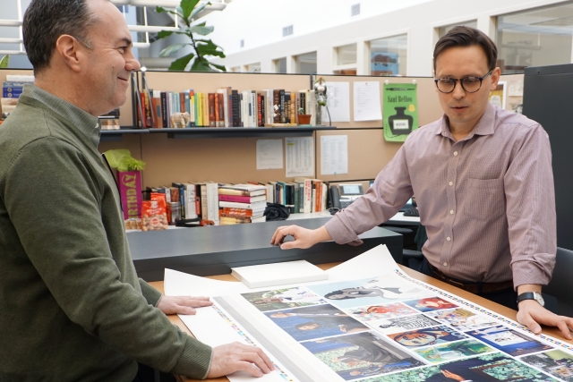
I understand that you and Rhys Conlon of the National Portrait Gallery traveled to Italy, where the book was printed, for a press check.
Yes. After the files were calibrated and corrected, they were sent to Graphicom, an art book printer in Verona with a long history of printing high-quality illustrated books. Rhys and I went to their printing plant to compare the digital proofs from ProGraphics to the printed sheets as they streamed out of the machine, determining where color needed to be added and subtracted to reach an exact match. I chose Magno satin paper for the interior of the book to draw out the richness of the images. Magno’s smooth finish also corresponds nicely with the matte lamination on the jacket.
As you mentioned, the jacket is a singular component of the complete package. How did the printers make it reversible?
Well, the trick is to make paper fold in the opposite direction cleanly. At the Graphicom bindery, the printers suggested laminating both sides of the jacket and scoring all the folds. The scores create a ridge along the fold line and ensure that the paper bends smoothly. My mentor, Gianfranco Monacelli [founder of Monacelli Press], once told me, “Paper has memory.” That’s always stuck with me. Paper has memory. To make the jacket reversible, we had to work against (or maybe with?) paper’s ability to remember.
Final thoughts?
It was gratifying to work on this project, largely because of the subject matter and the success of our collaboration. But it was also difficult to carry out—from a printing perspective. The portraits required a lot of attention. Bright and neutral colors are difficult to print together. But working with true professionals, each equipped with a good eye and judgment, made all the difference.
That’s a good note to end on. Thank you.
Graphicom’s motto, “We print the impossible,” was indeed borne out in the printing of The Obama Portraits. That note of confidence and ambitiousness, combined with a high degree of care and expertise, applies equally well to the book’s production and to its key players. They know, as every publisher does, that behind every book is a network of interweaving decisions, a series of well-defined stages, and a set of strict timeframes. When these go according to plan, the outcome is often a work of beauty and excellence.
Steve Sears, the production manager for art books at Princeton University Press, oversaw the making of The Obama Portraits in collaboration with the acquiring editor, Michelle Komie, the project editor, Terri O’Prey, the publications director of the National Portrait Gallery, Rhys Conlon, and the designer, Miko McGinty.