A friend of mine once told me the story of their first day working at a major East Coast firm just after graduating from architecture school. As soon as they arrived, before even being shown how to use the coffee machine, they were given a thick bound volume to study. Printed in house, the book contained the key to the practice’s graphic signature, with specifications for everything from the preferred office font to the types of birds that should be shown flying in backgrounds of perspective views. Perhaps most important, it detailed the particular color scheme by which anyone looking at a rendering would recognize, by instinct only, the architectural office who produced the design.
Architecture is represented not only with lines, figures, and words, but also with colors. What sounds like a truism today—when colorful, computer-generated renderings of building projects dominate architectural media—is in fact a relatively recent phenomenon. For most of their history, architectural representations destined for clients or potential clients have largely been devoid of colors, at least of diverse hues. In Europe, Renaissance architects were the first to systematically privilege graphic means in the expression of their ideas, breaking with a long tradition of oral transmission of knowledge, to the point of associating mastery of draftsmanship with architectural proficiency. During the eighteenth century, drawing increasingly typified the profession itself, as it was gradually deemphasized within other trades, such as masonry, engineering, contracting, and sculpture. But color was never deemed essential to conveying architectural information. Indeed, it was even dismissed as a dangerous distraction from the figuration of exactitude and truth, an idea dating back to Aristotle. On top of that, Renaissance architects started to rely more and more on prints as models, and architectural prints were consistently inked solely in black. The result of this situation was a notable historical fact: that the vast majority of architectural drawings before the advent of modern inkjet printing were monochrome. But what about those drawings that do show a variety of colors? How should we understand them, and what do they tell us about their producers, the people meant to view them, and the contexts in which they were created?
The strength among architects of the Italian-Renaissance association of pure architectural representation with monochromy, meant that instances of diverse colors often appeared where the strict disciplinary boundaries between architecture and other fields was blurred. For example, one of the main reasons why Dutch architectural drawings of the 17th century are so colorful is that most of the leading civic architects working in Amsterdam or Haarlem at that time were first trained as painters. They naturally applied colors to indicate the hues of the various materials they wished the client and builders to employ: red for bricks or yellow for wood for example. Here, architects and painters shared the same impetus for mimesis, an imitation of the visible world. During the same period, however, Amsterdam was also the center of Europe’s map-making trade, a field that shared with architecture a relationship with the representation of the visible that went beyond the mere imitation. While architecture necessarily relied on abstraction to indicate plans and sections (views of buildings that do not actually exist), cartography did so to encompass immense scale, representing the earth from a vantage impossible until the invention of flight. Both representational systems relied on the common use of graphical signs, where the signifier is instinctively linked to the signified: the way a line figures a wall on paper, or a pair of sinuous lines indicates a river on a map. Color is one of the oldest signs in cartography, notably with respect to natural features: green for a pasture or brown for a mountain, without a strict adherence between the hue of the feature and that of its drawing. Architects embraced chromatic natural signs: red for tiles, how baked they were, or blue for roof slate, which can be found in quarries in colors ranging from vivid blue to almost black. What counted here was not so much the close imitation of the visible, but the clear indication of a solution when different options were possible. There were only so many ways to cover roofs in 17th-century Amsterdam—tiles, or slate, and sometimes copper. Instead of painfully drawing the different roof elements, the draftsman washed the entirety of the roof in one color, saving considerable time and energy. The color did not require any explanation, so long as it was close enough to that of the material. This began to break down, however, whenever the signified and signifier became disjointed.
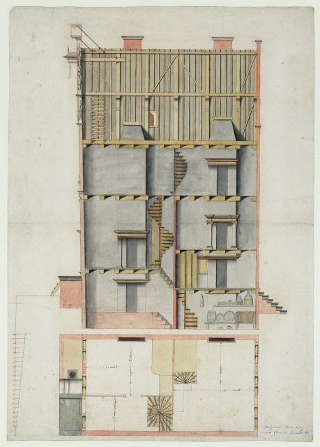
In the drawings of French fortifications made at the end of the 17th century, the masonry elements that are drawn in vertical section are typically washed in red. As mentioned above, the use of red in architectural drawings during this period in Amsterdam clearly indicated the color of the wall material, namely brick. But French fortification walls were made with stones, and sometimes earth, neither of which is red in the visible world. Imitation had thus become convention. A convention, in the words of Raymond Williams is “an established relationship, or ground of a relationship, through which a specific shared practice—the making of actual works—can be realized.” To understand a conventional sign, one must belong to a shared community that agrees on its meaning. At the end of the 17th century, such a community did not exist within architecture, which was not yet professionalized, and had no institutionalized or systematized training.
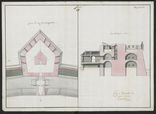
The shift from an imitative to a conventional use of color in “architectural” representation at the end of the 17th century occurred in the milieu of French military engineers, precisely because they were a coherent, centralized corps in need of a common graphic language devoid of any ambiguity. Frontier fortification sites were by their nature far from centralized design centers (i.e. large cities like Paris) and the stakes of their design were much higher than in civil architecture: misinterpretation of the design or of the material quality could occasion the fall of the fort, or even the country itself. Consequently, the maréchal de Vauban, the head of the corps, wrote extensive instructions detailing which colors his subordinates were to use to convey precise architectural information. The system was so efficient that it was later adopted by architects through manuals of architectural draftsmanship written by military engineers, but also in the private schools of architecture that flourished in the 18th century. The red wash indicating a graphic convention—the sectioned masonry on paper—rather than a similar-looking material—brick—was thus progressively adopted by the entire architectural community, a convention that lasted until the end of the 19th century.
This balance between imitation and convention of course runs through the entire history of color, but in the case of architecture, it offers particular insight into the anxiety of a profession that has always been torn between the world of painters and that of engineers, between art and craft, between aesthetics and science.
Basile Baudez is assistant professor of architectural history in the Department of Art and Archaeology at Princeton University. His books include Architecture et tradition académique and A Civic Utopia: Architecture and the City in France, 1765–1837.