
Every branch of knowledge seeks to provide an account of—something: the past, the present, the mind, culture, institutions, social and physical phenomena. We say account because knowledge is often perspectival, notwithstanding the careful research, meticulous evidence, and broad consensus that underlie our best explanations. Jim Al-Khalili’s new book, The World According to Physics, evinces that point in its very title. Indeed, physics tells a certain story about reality, one that has tremendous explanatory power and empirical support. I spoke with designer Chris Ferrante about his approach to designing a book that seeks to explain—the world.
What excited you about taking on this project?
CF: One of the most gratifying aspects of my job as a book designer is giving visual and tangible form to ideas by authors who are leading thinkers in their fields. Jim Al-Khalili is certainly one of those authors who can communicate complex concepts in a way that makes them accessible to any reader. I knew from the outset that the design of this small, relatively short book had to clearly signal both the authority and accessibility of the content.
I see how that might pose a challenge.
CF: Well, the challenge was to create minimal design with maximum impact. It was a challenge I was eager to accept!
The cover design has a very spare, geometric quality. There are essentially two shapes in your composition: rectangles and circles. Why did you decide to work with such a limited palette?
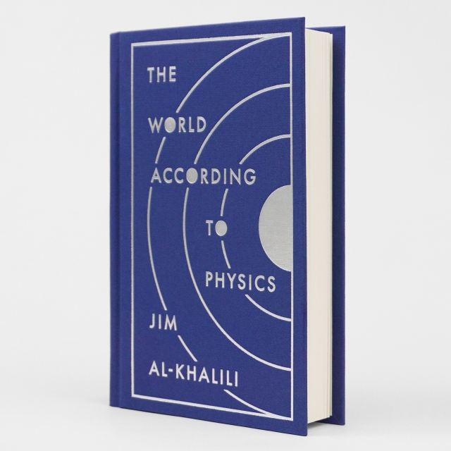
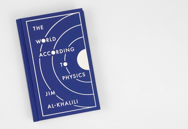
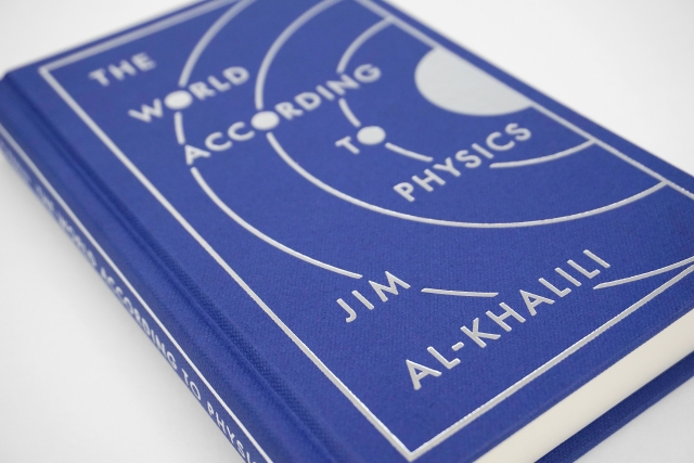
CF: The book introduces readers to the four fundamental concepts of space, time, energy, and matter, then describes the three pillars of modern physics: quantum theory, relativity, and thermodynamics. “Fundamental” and “pillars” are the two words with the most weight here. In brainstorming ideas for the cover, I knew that the design had to convey the gravity (pun intended) of these pillars of physics in a simple, minimal, fundamental visual language. Basic geometry—pure, mathematical line and shape—is that perfect visual language. I began thinking about imagery that symbolizes physics operating at different scales, from the cosmological to the molecular: planets orbiting a sun, electrons orbiting a nucleus. What shape do they have in common? Circles. Concentric circles.
Which also appear in the letters of the title.
CF: Exactly. In the letterforms of the title’s three Os: WORLD, ACCORDING, TO. A clear motif presented itself: a sun or nucleus as the central point of illumination, expanding into three concentric layers of knowledge. Three orbits. Three planets/electrons. Three Os. Three pillars. Appropriately, the third circle from the center symbolizes Earth. With the words of the title arranged outward from the center, the “Earth” aligns with “WORLD.”
Very perceptive! How about the typeface? You made sure that the type was carefully integrated with the design.
CF: I chose Futura, a geometric sans-serif typeface, which is monolinear in weight like the lines of the orbits, with letterforms constructed of basic geometric shapes: a perfectly circular O; a triangular A; square right angles; pure, rational proportions.
Why blue?
CF: So many covers of books about physics are black, so I wanted to do something different for the genre. An eye-catching, rich blue background seemed appropriate; it’s both celestial and evocative of blueprints, underscoring the architectural, diagrammatic form.
Your creative process seems very well reasoned. Is this how you usually work?
CF: I approach every project first by reading in some form or another. Often, the manuscript may not be ready at the time when I have to begin designing the cover, so a descriptive summary of the book prepared by the editor is helpful for figuring out what it’s about, who the target audience is, etc., and this informs the design direction. I always try to come up with cover designs that are conceptually strong, that capture the essence of the author’s ideas in unique—and, ideally, clever—visual form. There’s no “one size fits all” way to navigate the design process; no two covers are the same because no two books are the same!
Tell me about the correspondence between the interior design and the cover.
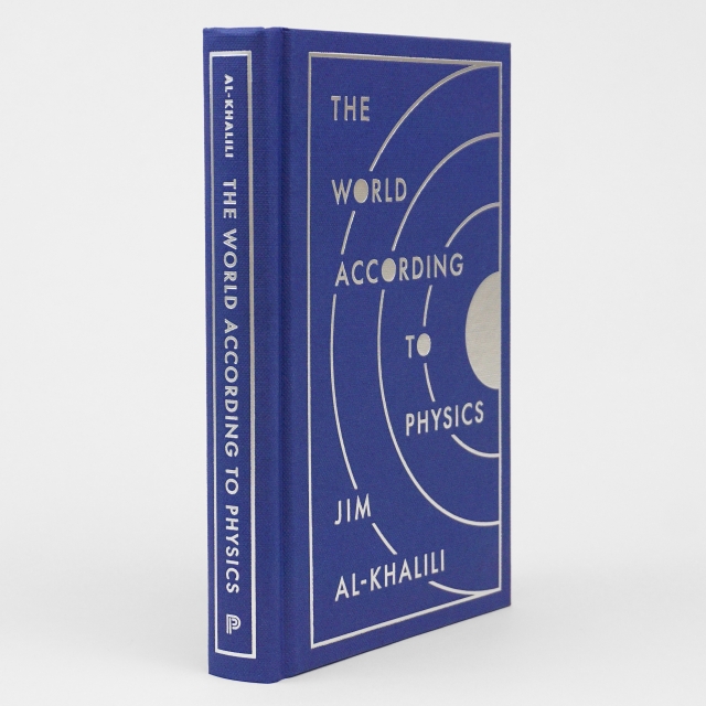
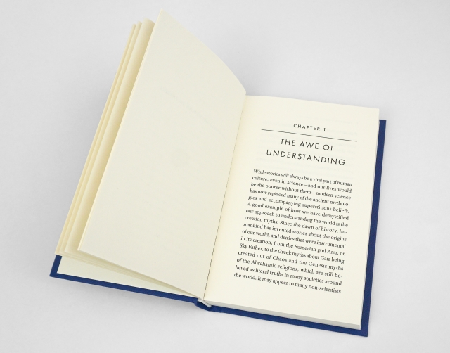
CF: Well, a perk of being an in-house designer is that I get to create both the cover and text interior for many of the books that I design. In most cases, I’ll design the cover first, which informs the typography of the interior for a cohesively designed package, from cover to cover. Good interior text design is such that the elements of the page—typeface(s), type size, line spacing, text column width, margins, etc.—don’t distract from the reading process. For this book, I kept things simple, with the main text set in Adobe Text—a highly readable serif typeface—and the display elements (chapter titles, subheads, etc.) set in letter-spaced, all caps Futura, to match the cover typography. A simple horizontal line separates chapter numbers from chapter titles to harmonize with the linear quality of the cover art.
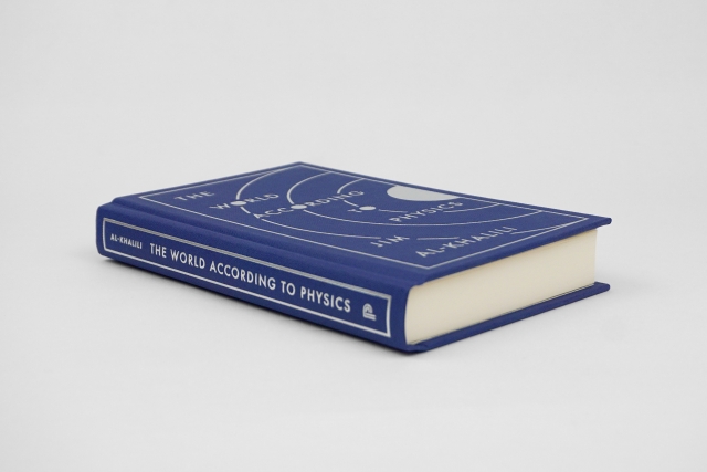
The book clearly stands out as an art object. It’s inexpensively priced, yet the binding materials feel luxurious! Describe how you arrived at these choices.
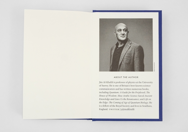
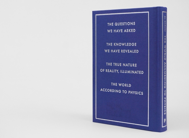
CF: Besides lusting after fonts, I derive perhaps no greater joy than from choosing binding materials! In this case, the minimalist cover design made the choice of materials even more important to get right. I picked a dyed blue, subtly textured paper that resembles traditional book cloth, and dusted silver foil for stamping the text and art on the front and back panels and spine. In lieu of jacket flaps, we printed the descriptive copy and author’s photo and bio on the endpapers.
The back cover is usually reserved for review blurbs, but I noticed this book has only a few lines of text on the back. You’re breaking with a certain paradigm here. What was the thinking behind this?
CF: That’s right. Since this book is unjacketed, textured paper over boards, tiny, delicate text runs the risk of filling in when stamped in foil. So, we decided to do something unconventional. The book’s editor, Ingrid Gnerlich, came up with the idea of including what she coined “deconstructed copy” on the back panel. After some brainstorming with Ingrid and copywriter David Campbell—which, as with any good creative collaboration, yielded some dull, fortune-cookie-like drafts—we arrived at four lines that read something like a cross between a poem and a tagline:
The questions we have asked
The knowledge we have revealed
The true nature of reality, illuminated
The world according to physics
Eloquent, pithy, and thought-provoking. The lines perfectly sum up the ideas explored inside the book, enticing the reader to crack it open and dive in.
And if The World According to Physics is ever turned into a feature film, we’ve got the perfect script for a trailer.
CF: Actually, we made a book trailer: animation by Layla Mac Rory, and voiceover by Jim, of course!
Christopher Lapinski is the design coordinator for the Creative Media Lab. Chris Ferrante is a senior designer in the department.