Vector Art
Charts, maps, diagrams and other graphics where legibility and fine details are important need to be submitted in vector format. Vector art is resolution independent and it provides optimum flexibility for making drawings and text corrections.
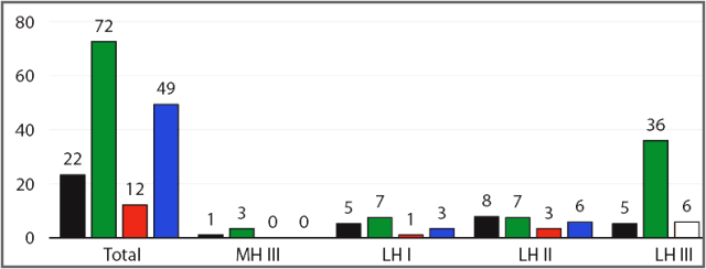


- Standard application: Adobe Illustrator. If you are not using Adobe Illustrator, we may be able to help you redraw or revise Word, Excel, and some other format illustrations.
- Accepted formats: EPS (preferred), PDF, AI. Please note that simply resaving a JPG to EPS or PDF does not magically turn it into a vector image, the image needs to be redrawn in vector format.
Settings
- Use CMYK color space (not RGB).
- If your illustrations must be b/w, make sure that your colors are limited to black, white, and intermediate shades of black.
- If your book will be printed in color, use only CMYK colors.
- In the EPS saving dialogue, select TIF preview; Embed fonts.
- Please use standard, professional quality fonts. OpenType and TrueType are acceptable; do not use PostScript fonts.
Raster Art
Raster formats are meant primarily for photos and scans. The most common raster format is TIF (preferred); JPG, PNG, and BMP are also acceptable. Avoid scanning to PDF format. Please do not create charts, maps, and diagrams in JPG, PNG, TIF, or other raster formats. See the previous section for vector art.
Raster images are composed of small dots/pixels; the more pixels, the more visual information the image contains. Reproduction quality of raster images largely depends on the dots’ density, or resolution. Resolution is usually measured in dpi (dots per inch).
Resolution Requirements for Raster Art
Black and white bitmaps without any shades of gray or color tints need to be 1,200 dpi. For example: a 5-inch wide image should be 6,000 pixels wide. Black and white bitmaps are usually scans of text or black and white graphics with fine details that need to be reproduced legibly in print.

Grayscale and color images need to be 300 dpi. For example: a 5-inch wide image needs to be 1,500 pixels wide. These are usually photographs, screen captures, scans of paintings, etc.
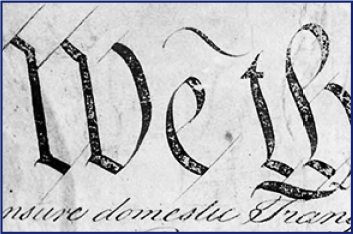
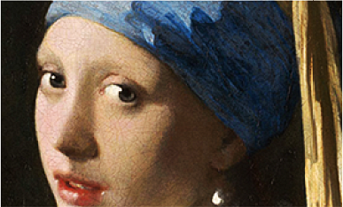
PUP will grayscale your images if your book will be printed in black and white.
Please note that resolution requirements increase if you need to zoom in on a fragment of an image.
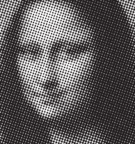
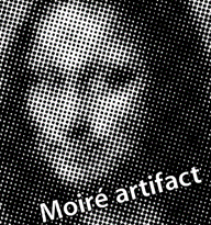
Avoid scanning grayscale or color illustrations from all modern (since early 1900s) books and newspapers; it leads to image deterioration and moiré printing artifact. Even though we can get rid of the artifact, some quality loss is inevitable. For best results please provide scans of the originals.
Tips for Preparing Maps
An excessive amount of redundant information is one of the more common problems with map illustrations. Unlike atlas maps, illustration maps need to show only the information relevant for the text in a clear, reader-friendly style. Secondary information should be de-emphasized or omitted.
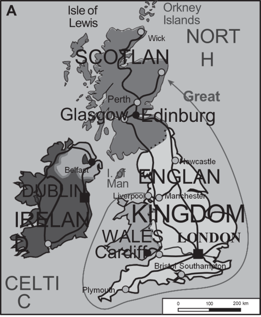
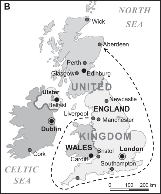
- Avoid setting very large type, but keep the labels large enough to be legible. Use boldface to convey a hierarchy of elements rather than extreme font size variations. Use one or two font families in a consistent style.
- Color maps converted to b/w often become unclear; adjust the tones for b/w reproduction.
- Keep ample contrast between the labels and the background; avoid overlapping labels, which are usually black, with the black lines used for borders, etc.
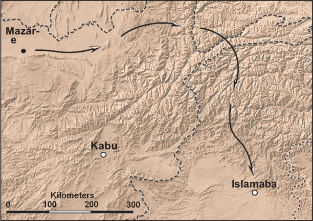
Though maps should be created in vector format, raster format can be more appropriate for some of the elements. The sample shown here contains an imported sepia colored terrain; its complex tonal transitions are well conveyed in raster format. The diagrammatic elements that require precision and flexibility for making corrections (the type, the border lines, the arrows, and other cartographic symbols) are in vector format.
Tips for Preparing Charts
Microsoft Excel and many other applications used to create charts are not designed for printing press requirements. However, these charts can be exported to PDF and then edited in a vector based program.
Though Excel is a cumbersome environment for illustration work, it is a good idea to minimize problems in Excel before exporting the chart to PDF. The following chart depicts many of the problems commonly encountered in charts and other graphics submitted by authors.
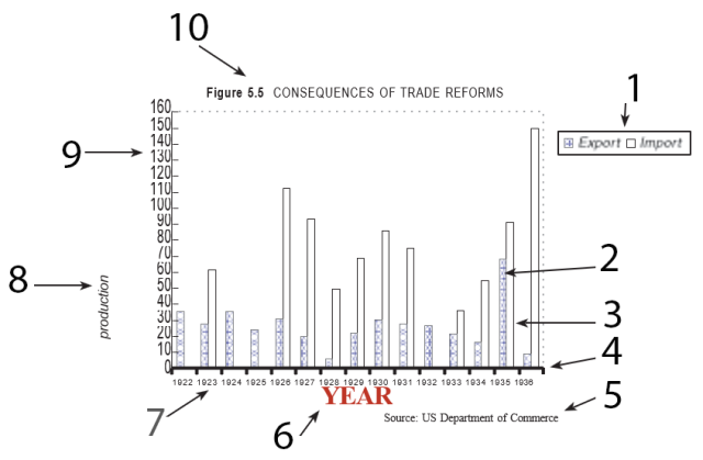
- Bad key placement; spaced too close, rasterized.
- Complex pattern should be avoided; color should not be used if the figure is b/w.
- Line weight is too light
- Line weight is too heavy.
- Source line or note belongs in the caption.
- Set too close to the numbers;
inconsistent font and type size (too large);
wrong case - initial cap only;
color should be used selectively and only if the art is printed in color (in this case omit since “YEAR” is redundant). - Type size is too small, should be around 7 - 10 pt at the final size;
the numbers are set too close together. - Unit of measure is missing;
too distant from the chart;
poorly centered;
the initial letter should be capitalized. - Numbers are set too close to each other and to the axis;
the font should not be distorted. - Figure number and title are not part of the figure;
they belong in the caption.
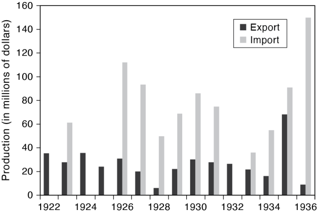
Below is a final chart, most of the problems were resolved in Excel. The exported PDF was opened and fine-tuned in Illustrator, then saved in EPS format for book production.
Accessibility
PUP is committed to making our content in all formats as accessible as possible to the widest possible audience, including people with print disabilities.
Alt Text
Providing alt text for all images in your book will help support this goal. Please refer to our guidelines to learn more about what alt text is, why it’s important, and what we need from you.
Color Accessibility
Color images in our books must be comprehensible to people with any degree of color blindness. The following guidelines will help you create color art that all sighted people can view without difficulty.
Color Accessibility Guidelines
Frequently Asked Questions
Is it OK to submit color photos if there will be no color in my book?
It is OK to submit color photos for b/w reproduction; however, keep in mind that contrasting colors may translate into very similar shades of gray, making the image unclear in some instances.

The image I am submitting is centuries old and it does not look great; is it OK?
Cracks in a fresco, faded photos, and other natural damage artifacts are fine. However, reproduction defects due to incorrect scanning, low resolution, etc., affect the validity of the images and the overall appearance of the book. As a responsible scholarly press, we care about the reproduction quality of historic materials no less than modern ones.
Will you accept maps/charts created in Photoshop?
If a historic map or chart is scanned and processed in Photoshop, it is fine. If you are creating a new chart or map, it needs to be generated in a vector format and not in Photoshop.
I heard that JPEG images have quality problems; should I be concerned about submitting my art in JPEG format?
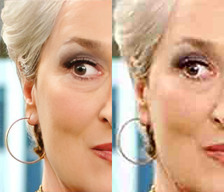
Most of the JPEGs we receive from authors are fine. Try to zoom in on the image/s and check for major artifacts similar to the sample shown here. Very minor artifacts will not be noticeable in print.
What is wrong with labels embedded in a photo?
Labels embedded in a photo are very difficult to edit and they will not reproduce well unless they are in vector format.
Do captions need to be submitted separately from figures?
Yes, figure captions need to be submitted in a separate file from illustrations and from the text.
Do tables need to be submitted separately from figures?
Yes, tables should be submitted separately from the figures and from the text.
Do figures need to be created at final size?
It is preferable if the figures are submitted at reproductions size, this helps to keep a consistent style throughout the book.
What makes a good illustration?
There are many types of illustrations: some play a central role; others simply help to clarify the text, or help engage the reader. It is important to understand the role of each illustration and its impact on the overall appearance of the book. It helps to look at a variety of books with effective illustrations, and to follow the art guidelines.
Glossary of Common Illustration Terms
Adobe Illustrator - The leading application for creating and editing vector images, as Adobe Photoshop is for raster images.
AI - Native Adobe Illustrator file with “.ai” file extension. AI is vector based.
Bitmap - 1. Image Mode in Photoshop limited to b/w without gray tones. 2. A common raster format (BMP) capable of reproducing millions of colors.
Black-and-White (b/w) - 1. Without color. 2. Strictly black and white without intermediate ray tones.
BMP - Microsoft graphics file format for raster images.
Camera-ready art - Photographs, drawings, transparencies, and other hardcopy materials, properly prepared and ready for scanning.
Caption - A general description of an illustration including the figure number and title. A caption is not part of the figure image; it is usually set below the illustration.
CMYK - Color system based on four ink colors used in standard full-color press printing: Cyan, Magenta, Yellow and blacK.
Color mode (or color system) - A system of color supported by a computer application.
Continuous-tone image - An image that has virtually unlimited range of color or shades of grays.
Descreening - Getting rid of the halftone pattern during the scanning to avoid moiré artifact.
DPI - A system of measuring the resolution of images based on the density of Dots Per Inch.
EPS - Encapsulated PostScript is a standard, vector-based graphic file format supported by all major page layout applications.
File extension - A few characters at the end of a filename, following a period. The extension defines the type of file and helps the computer to select the correct application for handling the file.
GIF - Graphics Interchange Format, a raster image format limited to 256 colors, used mostly for the Web.
Halftone - A simulation of a continuous-tone image using a grid-based pattern of dots.
Interpolation - Any image resizing that changes the number of pixels in an image. Usually refers to an undesired artificial increase of pixels meant to stretch the image size.
JPG (or JPEG) - A common raster image format developed by the Joint Photographic Experts Group. The format is known for its ability to compress to very small file size at the expense of image quality.
JPG compression artifact - Visible image damage caused by JPG compression.
Label - A textual call-out identifying a specific element or a part of an illustration.
Leader line - A line pointing from a label to a specific element or detail of an illustration. Leader lines may be plain or tipped with arrowheads.
Line art (or binary art, also b/w bitmap) - A type of graphic limited to b/w without any intermediate tones.
Moiré - An undesired artifact usually produced by reproducing a halftone scanned from a book, a magazine, or a newspaper.
Offset printing - The standard industrial printing technique employed for book printing.
PDF - Portable Document Format is a standard format for exchanging platform-independent documents viewable using Adobe Reader and Adobe Acrobat software.
Pixel - The smallest discrete component of an image.
PNG - Portable Network Graphics, a raster image format that uses lossless data compression.
Point (pt) - Standard unit of measure used for measuring line thickness and type sizes (1 inch = 72 pt)
PostScript - A programming language instrumental for modern publishing, typography, and vector graphics.
PSD - PhotoShop Document is a native Photoshop file.
Raster graphic - A resolution-based image composed of pixels.
Resolution - A measure of the amount of image data per square inch or centimeter.
RGB - The most common color system used by computer applications, based on Red, Green, and Blue.
Serif fonts and sans serif fonts - Fonts with and without small lines or extra elements at the end of some of the character strokes.

TIF (or TIFF) - Tagged Image File Format is a standard, raster graphic format supported by all major page layout applications.
Vector graphic - A resolution-independent image used primarily for charts, maps, and diagrams.