Color Accessibility Guidelines

Princeton University Press is dedicated to making books visually accessible to everyone. To that end, color images in our books must be comprehensible to people with any degree of color blindness. The following guidelines will help you create color art that all sighted people can view without difficulty.

Conversion to Black and White

The simplest way to check figures’ accessibility is to convert them to black and white (alternatively, you can print the figures in black and white). Contrasting colors in the chart below may be indistinguishable for readers with color perception problems. Note that red, blue, green and purple appear almost identical when you convert them to black and white

Line graph with colored lines indicating different countries. The solid lines are difficult to distinguish for individuals with color vision impairment. Beneath the graph an arrow reads "Conversion to black and white."
Line graph with black and grey lines indicating different countries. This converted graph illustrates how the solid lines are difficult to distinguish between for individuals with color vision impairment.

Color and Tone

There are a number of ways to make your figures more accessible to
readers with color perception problems:

Rely on tonal (light vs dark) rather than on color contrast. 

Low Accessibility:

Diagram of virus attacking cell with orange background and low contrast text labels. Example is labelled "Low Accessibility."

High Accessibility:

Diagram of virus attacking cell with dark background and high contrast text labels. Example is labelled "High Accessibility."

Text Label Background

If possible, set black labels on light background and white labels on dark background.

Sunset picture with black text on light sky background and white text labels on dark tree background.

Regarding Color Type

Avoid using color type, particularly yellow. Solid black is preferred.

Cell and virus diagram with difficult to read light colored text labels.
Cell and virus diagram with easy-to-read black text (on white background) labels.

Line Stroke

Use different stroke patterns for plot lines.

Diagram with solid colored stroke lines, difficult to distinguish for visually impaired.
Diagram with differently patterned dotted and dashed colored lines. This makes the chart easier to understand for all.

Scatter Plots

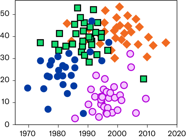
For scatter plots, consider using different shapes and/or outlines for different data points.
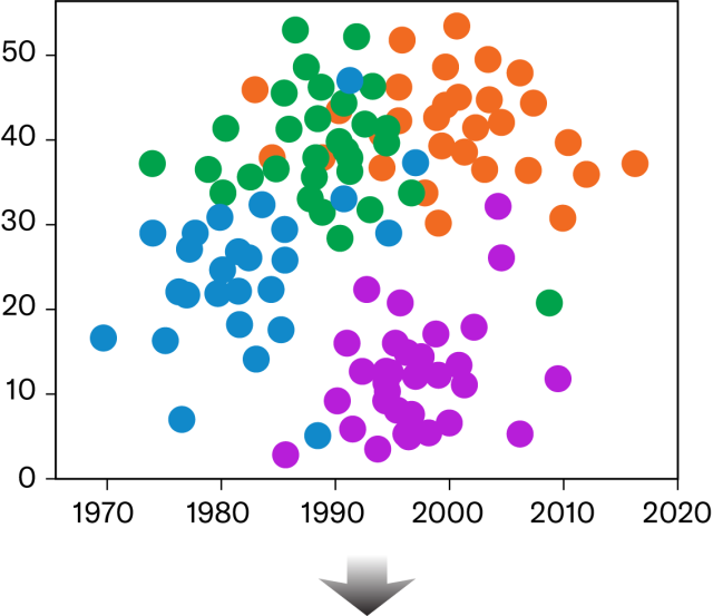
Scatter plot, all data points are shaped as circles. This makes it hard to differentiate for those with color vision impairment.
Scatter plot, data points are differentiated by shape as well as color. This makes it easier to decode by those with color vision impairment.

Chart Label Location

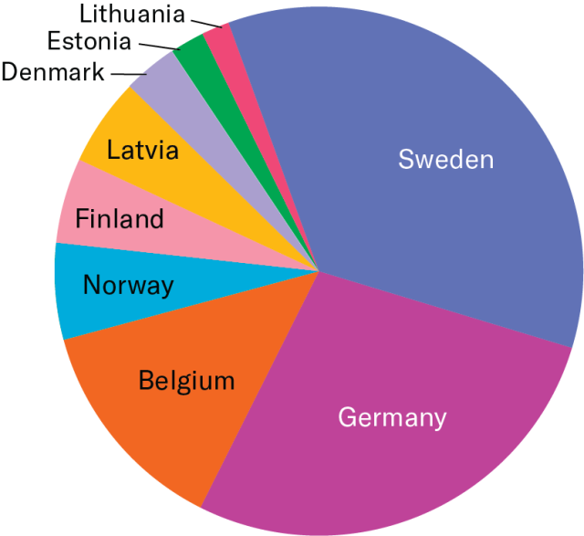
Label data directly, if possible, instead of using keys.
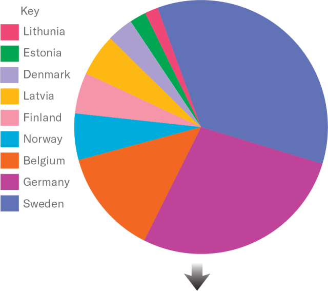
Color pie chart. Labels for each section are listed in a Key to the left of the chart.
Color pie chart. Labels (country names) are shown directly within pie slices when space permits. Labels for thin slices are in black text with a line connecting them to the slice.

Pie Chart Outlines

Use outlines, where feasible, for greater clarity between slices.
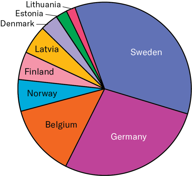
Color pie chart with black outlines around diameter and between each section/slice.

Offsetting with White 

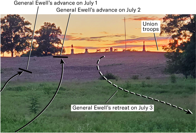
If the background is busy, consider offsetting your arrows, leader lines, and labels with white.
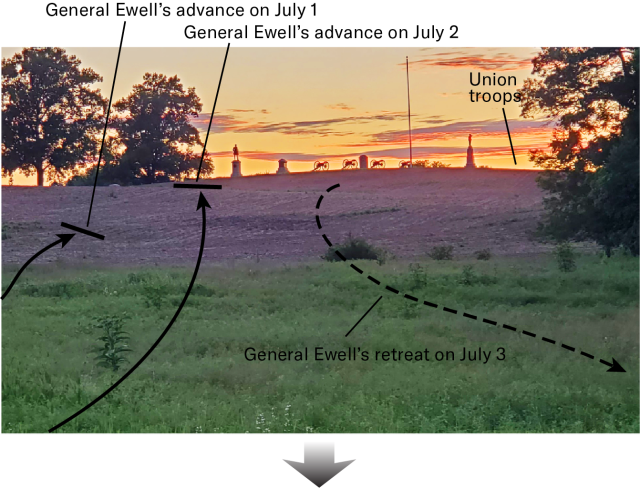
Busy battlefield background image overlaid with difficult to read black directional lines and text.
Busy battlefield background image overlaid with black directional lines each offset with a white stroke and 2 textboxes with black text on white background.

Lighting and Contrast

If you are taking photos to illustrate your book, please make sure there is sufficient lighting and background contrast.

Dimly lit decorative metal urn on deep red background, low contrast, low accessibility.
Well lit decorative silver urn on white background, high contrast, high accessibility.

Resources

  • Color Oracle – Allows on screen preview of 3 types of color-blindness and grayscale for overall value contrast.
  • Colour Contrast Analyzer – Can sample 2 colors from your screen to check their contrast with each other. Will also give pass/fail info. It provides color "recipes" in RGB.

Color Accessibility Guidelines PDF