Sales catalogs have a noble lineage, one that an academic press would gladly embrace. The first catalog was published in Venice in 1498 by Aldus Manutius, founder of the Aldine Press. It was an inventory of books Manutius had printed, including editions of Aristotle and Aristophanes, using the relatively new technology of the time, the printing press. Five-hundred years later, catalogs are still being circulated, still coaxing customers across diverse markets, and—in the context of publishing—still heralding new books.
Princeton University Press’s seasonal catalogs, subject catalogs, and international rights guides are among its most valuable publications. Tens of thousands of copies are published every year, distributed to booksellers, wholesalers, sales representatives, libraries, review media, foreign and domestic rights agents, and conference attendees. These catalogs testify to the collaborative nature of publishing and to the scope of PUP’s mission. They have a practical function, for sure, but there’s no denying their aesthetic quality, what with their artful interweaving of imagery, copy, and typography. Now, having recently been redesigned and refreshed, they are poised to reach new readers in the twenty-first century. To learn more, I spoke with Heather Hansen, the Press’s Marketing Art Director, about her masterful work on our catalogs.

How did you get started designing the Press’s catalogs?
HH: I love books and I like to think our catalogs are books about books. When I started working at the Press, my job was focused on catalog content, but I was inspired by our catalog designers and very interested in typography. That interest led to design classes, freelance work doing banners and booklets for our local education foundation, and more Press opportunities to expand my work into catalog design.
You received your B.A. in biology. Tell me about your transition to design.
HH: I enjoy the visual and hands-on aspects of biology and viewing the world from both a macro and micro perspective. My favorite experiences with biology are design-related: reviving a college herbarium and darkroom work in a cell biology lab. Herbariums are collections of dried plants used for reference and scientific study. In college, I spent time collecting native plants, drying and mounting them to highlight identifying characteristics, then labeling and organizing the collection. After college, I did research in a cell biology lab. My favorite days were those in the darkroom developing photographs of fluorescent-stained cells and protein gels for presentations and publication. Looking back, I’ve really been doing design all along!
Our catalogs are a kind of herbarium, aren’t they? How do you go about designing them?
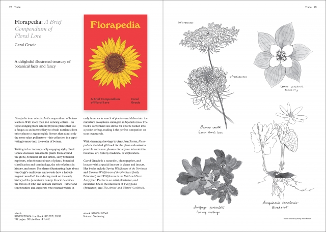
HH: Yes, what a cool thought! Catalogs are an organized collection of our books, and I do my best to showcase each one. I like catalog design because it’s focused on typographic considerations. When I work on a new design, I think about elements of macro-typography (grids to size and position, columns of type, illustrations, and hierarchies of headings and subheadings) and micro-typography (letter-spacing, word spacing, line spacing) in order to choose optimal elements for readability. When everything is in harmony, the reader is drawn in by the book cover and can focus on the book’s descriptive copy without typographic distractions.
Speaking of harmony, our catalogs have just been revamped to better align with our new website. Could you describe how you approached this transformation from a design perspective?
HH: Modeling typography and design elements from our website was an opportunity to bring our online presence into print and to make the catalogs uniquely ours. After meeting with colleagues in sales, marketing, and promotions to best understand the audience, the tone, and the content we needed, I dove in and explored our website. The catalog covers were inspired by our home page; the two-page spreads were inspired by the Ideas section; and the book pages mimic our online book pages. I also used similar grids and typographic hierarchies. My favorite part of the process was meeting with our website design team to share my work and talk through tweaks and sticky items. All in all, I love the redesign: the look and layout are uniquely ours—typographic, clean, and engaging. When a bookseller or book buyer opens our catalog and visits our website, they should intuitively recognize our brand aesthetic.
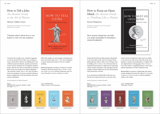
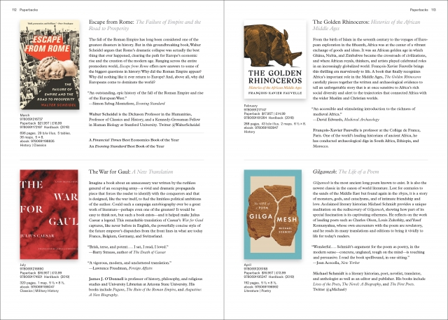
The seasonal catalog is, undoubtedly, the star of the show. Our subject catalogs, which highlight newly published works in their respective subject areas, are less well known but also do a lot of heavy lifting. How does your process in designing them differ from that of the seasonal catalog?
HH: All of the catalogs are collaborative projects, so I have the opportunity to work with lots of different groups at the Press. I design our subject catalogs in collaboration with our marketing and editorial colleagues for mailing directly to book buyers and for book booths at conferences.
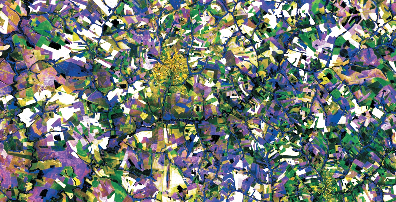
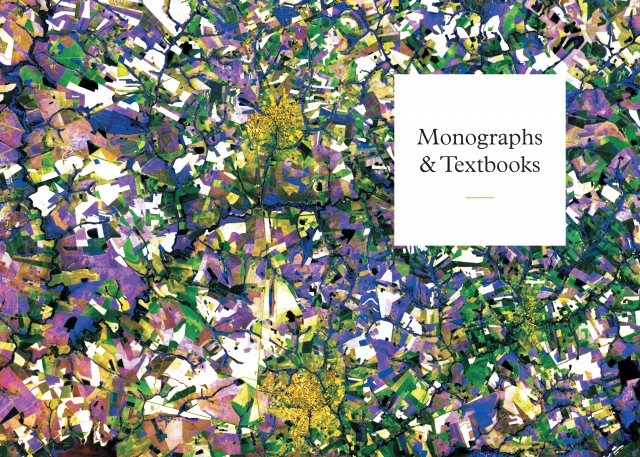
Since the subject catalogs are subject specific, a fun (and challenging!) part of the process is choosing cover art that reflects the different subject areas while keeping the collection cohesive as a group. My current art objective is to choose abstract patterns and graphics with bold colors, and to crop images in interesting ways. Sometimes I repurpose artwork from a book cover, but I also like to give the group additional options.

What’s your favorite design element of the catalogs?
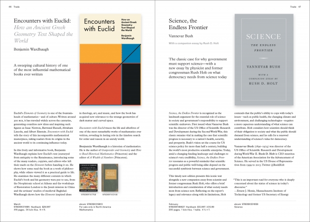
HH: I would say the two-page spreads in the seasonal catalog. After meeting with sales, marketing, and promotions colleagues on goals for the catalog, I began focusing on a punchier yet substantive design. The flow of the seasonal catalog is intentionally interrupted by special two-page spreads featuring unique content from some of our books. They’re designed to give the catalog a more editorial, magazinelike feel, inviting the reader to stop and engage with the books. While working on these page spreads, I fell in love with the books and their ideas—chalkboards, self-assembling materials, a graphic narrative of political unrest in Turkey, gorgeous natural history and art illustrations, underground ant nests, and more!
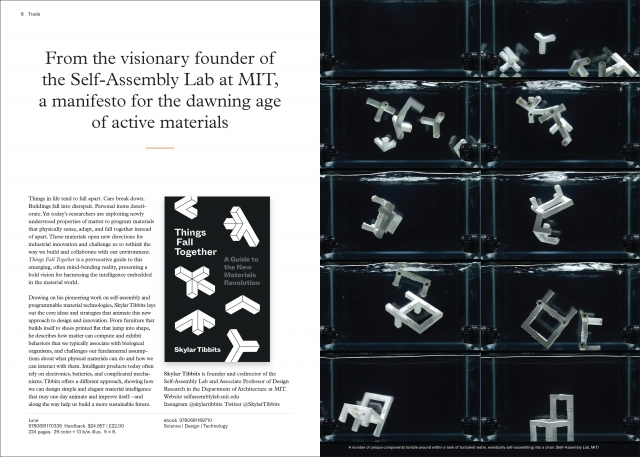
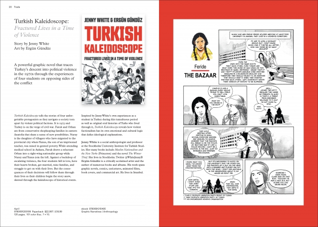

Download and explore all of our current catalogs here.
Christopher Lapinski is the Art & Design Coordinator for the Creative Media Lab. Heather Hansen is the Marketing Art Director.
