
Fairy tales exert a keen influence on the collective imagination. By turns entertaining and frightening, didactic and illuminating, they are the stuff of dreams, but also of reality. Folklorist and PUP author Jack Zipes underscores their ability to “expose the crazed drive for power that many individual politicians, corporate leaders, governments, church leaders, and petty tyrants evince.” In other words, folk and fairy tales can make us aware of oppression, injustice, and hypocrisy, and encourage us to resist them, not adjust to them. That’s a good way to describe the tales in Princeton’s Oddly Modern Fairy Tales series. Written in the twentieth century, these collections of fanciful narratives often subvert or reframe their traditional models, revealing grim truths about modern society with satirical flair. I spoke with the Tales’ illustrator, Andrea Dezsö, to understand her own relationship with folklore and her approach to the series.
You’ve carved out a space for yourself in the realm of fables and fairy tales. What draws you to them?
AD: I’ve always adored fairy tales and folklore. I grew up with them in 1970s Transylvania, in the same way children today grow up with Pokémon and cartoons. The adults in my life were always willing to share these stories with me. Since we didn’t have any television worth watching (it was all propaganda in black and white), listening to fairy tales was a way to travel inside my imagination, experience other worlds, other lives and possibilities.
That resonates with me. As a child, I was absorbed in books of fairy tales that my family in Communist-era Poland sent me in the mail. They were richly illustrated, often whimsical, sometimes gothic or macabre, and I was mesmerized by them.
AD: Then you understand their appeal! My favorite books were objects of beauty which I still cherish and own—after four decades, two emigrations, and countless moves. I adored these books’ rich illustrations, the most beautiful of which were often displayed on their covers. What wonders lay inside! Some of my favorites were part of a series of fairy tales from around the world. I saw them as families which shared certain visual traits, but also very distinct characteristics.
I agree. I still remember these qualities in my books, even if I’ve forgotten some of the stories.
AD: Exactly. Even before I knew how to read, I loved how each one had a different feel, a different character: the page layouts, line spacing, and typeface were all different—some letter pages looked denser, darker, more compact, while others were lighter, airier. And remember, these books were printed on letterpress, so when you touched the pages, you could feel the embossing on rows of text, and that made the surface of the paper feel slightly wavy. What’s more, each book was printed on different paper of different shades of white, smoothness, and transparency, so the pages not only turned with a slightly different rustle, but each book had its very own scent!
Reading these books, then, was a fully sensory experience for you. Not only that, but they constitute a part of your own creative lineage. That’s really wonderful. What was it about the Oddly Modern series that excited you?
AD: The diversity of the stories. There is always one I will find relevant, that will fit any day, mood, or situation. These volumes also bring me back to my earliest experiences of reading. The sound of a new book opening, the slight resistance of the binding and the spine, the first release of its scent—these things were and still are for me part of the excitement and anticipation of a good story. All of this makes working on the series particularly exciting and rewarding.
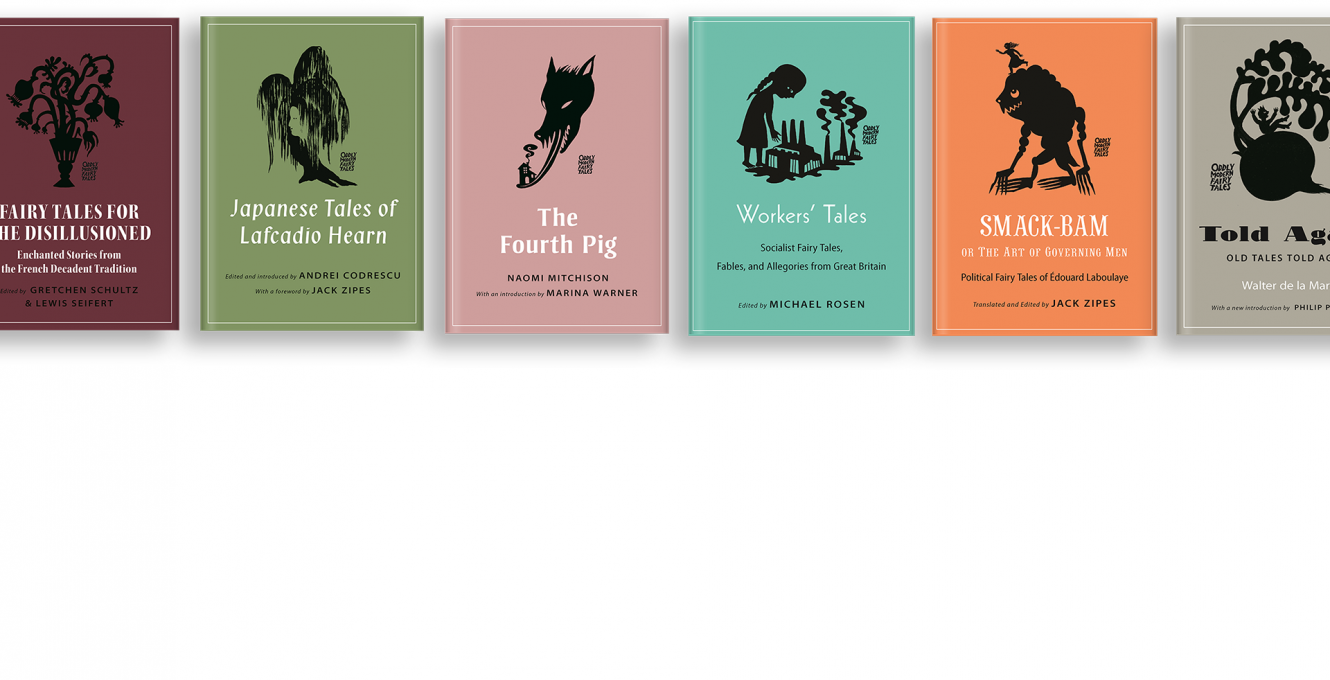
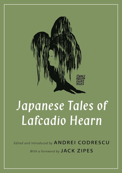
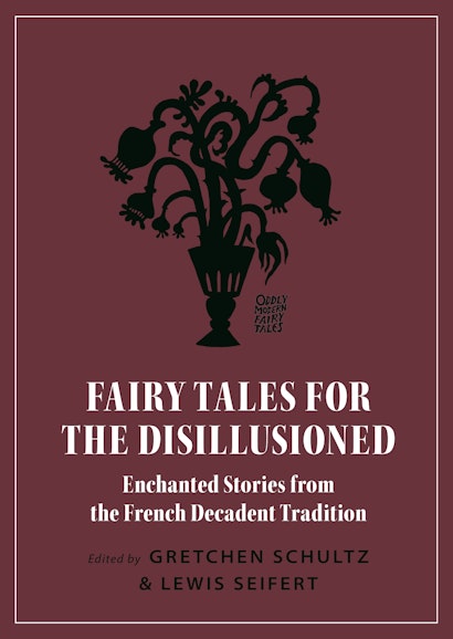
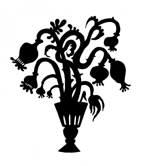
Your silhouettes are among the most recognizable features on the covers. How do you arrive at a single cover illustration that evokes the disparate narratives of each volume?
AD: I ask myself what the “heart” of the volume is and what single image would best represent this heart. The image has to work as a silhouette in a relatively small size on the cover, which are further concerns.
You seem to have mastered the art of working in these confined spaces. What materials did you use?
AD: A Japanese calligraphy brush-pen on paper.
You collaborate with our in-house designer, Pamela Schnitter, on the series. She’s expressed to me her own fondness for the Tales, and particularly for your illustrations. She says the series allows her to “stretch typographically”—which I take to mean that she feels free to innovate and experiment. Do you feel the same freedom?
AD: Yes, I do! For me, the two important aspects of any illustration project are creative freedom and inspiring material, and the Oddly Modern Fairy Tales series delivers on both. I see editorial illustration as a form of commentary—the visual expression of a personal interpretation of the text. I love the intellectual and creative autonomy I am granted in this project, and the platform it provides to engage with a compelling text.
Tell me a little about your technique.
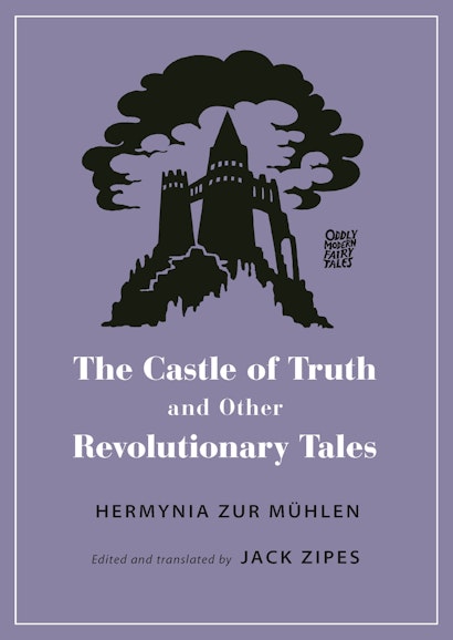
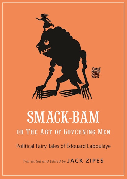
AD: I strive to clearly articulate my point of view about the text before I start drawing, even if it’s only for myself. Let me share portions of a message I wrote to Pamela, explaining my illustration choices for one of the series’ first volumes, Smack-Bam, or the Art of Governing Men. This was the only time I shared such detailed explanations of my thinking process about a volume:
It will be an illustration that aims to speak to the heart of the tales: the struggle of the powerless vs. powerful, small vs. big, human vs. monster. I feel strongly that the woman perched on top of the ogre/monster will appropriately capture the spirit of the book and attract readers.
What makes these tales relevant to this female-identified reader in 2018 is the little, weak, unprepared person, the unlikely hero going up in unequal and often unfair competition against the powerful—the ogre, the social system—and winning through smarts, courage, determination, good deeds or just mere luck. Many of the tales in the book feature an uneven struggle where the reader roots for the ‘little hero’ to prevail, and they often do. The salience of a book like this one, to me, is largely in the way the reader is invited to both experience the frightful implications of power, and to visualize resistance and disruption.
What makes this reader [me] cringe is outdated sexist, ableist or racial stereotypes when describing negative physical features. I was thinking hard and long, and wanted to represent an ogre body that is not a deformed human but an imaginary being made up of human and non-human parts.
You’re very conscientious in your approach to these stories—to their integrity and their thematic oppositions, while also respecting the view of the contemporary reader.
AD: Thank you. I try to be.
How do you and Pamela work together?
AD: I usually see the color and type treatment after the covers have been created, but I’ve been delighted by how beautiful each cover has turned out. I love everything about them and am very proud to have contributed to such a lovely series.
You created the Oddly Modern Fairy Tales logo, which is now the series’ imprimatur. How was that creative choice made?
AD: I seem to remember that the Press asked me if I would be willing to design a series logo, and I was happy to do so. Since the logo appears in such a small size on the covers, it had to be simple, easy to place among the other visual components, and easy to read. I love to create hand-lettered type, so I decided on a small, self-contained chop or stamp-like treatment.
Do you have a favorite tale or volume, or any that have changed your perspective on fairy tales?
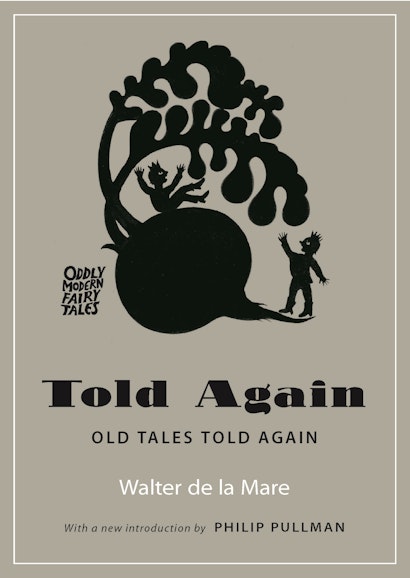
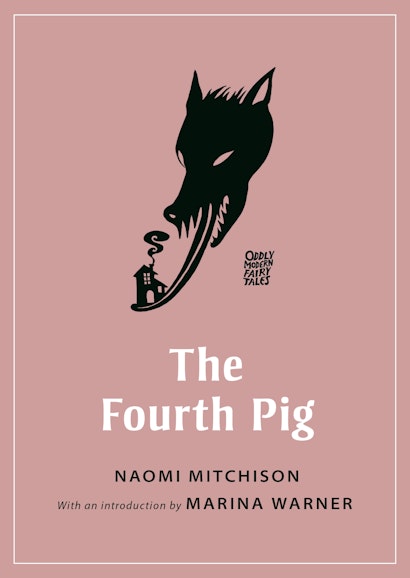
AD: I love every book in the series, so it’s a difficult question. My favorite volumes today are the Japanese Tales of Lafcadio Hearn and The Fourth Pig by Naomi Mitchison. Tomorrow I might pick a different volume—that’s the beauty of this series; the books are so wonderfully diverse I can pick any one up and find something that speaks to me in that moment.
That is as good a series endorsement as any I can think of. Thanks for speaking with me.
Christopher Lapinski is the design coordinator for the Creative Media Lab. Andrea Dezsö is a visual artist whose work is rooted in nature, folklore, and the imagination. She lives in a cottage at the edge of the woods in Western Massachusetts.