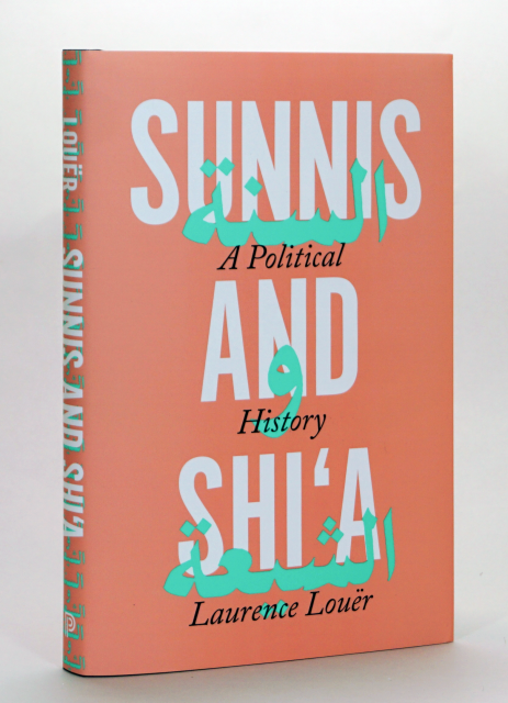
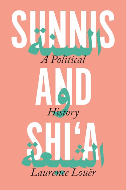
A typographic cover design poses a unique challenge. Unlike book covers that avail themselves of rich imagery, an all-type cover has to articulate a book’s subject with a greater economy of means. I spoke with designer Layla Mac Rory about designing the jacket of Laurence Louër’s Sunnis and Shi’a. A chronicle of the ancient Sunni-Shi’a divide, the book contests the popular belief that this sectarian conflict is irreconcilable, showing how both branches of Islam have, in fact, coexisted peacefully at various times throughout Islamic history.
Why did you decide on a typographic design?
Islamic tradition has a complicated relationship with imagery, so I decided I would avoid images altogether. But also the book’s title is so self-referential and immediate, I didn’t feel there was a need for an image—it probably couldn’t capture the subject adequately, anyway.
Agreed; the title speaks for itself. One thing you notice right away is the use of type and color, as well as the use of Arabic script. Can you say more about that?
I used large Alternate Gothic for the title and set it against a beige pantone background. I had been thinking about using Arabic from the beginning, but I couldn’t decide how to incorporate it. When I started drafting, I thought how cool it would be to insert the Arabic words for “Sunni,” “and,” “Shi’a” beneath each word in the title, and then to make the script overlap, creating a mirroring effect. I also decided to stylize the script in a green-cyan pantone to set it off even more. And, of course, the subtitle was placed in the gaps for a final lockup of the title treatment.
Without the stylized Arabic script, this could have been a fairly inert cover. But you use it as a design element throughout the jacket.
I do. The Arabic became an incredibly versatile design element for me. You can see how it plays an important role not only in the title treatment, but also on the spine and the jacket flaps—I mean, the way it dovetails between the front cover and the flaps.
The repetition of the title along the spine reminds me of Warhol.
Ha! I wasn’t thinking of Warhol, but maybe I was channeling him?
There’s also a conscious use of color.
Yes. When we first met to discuss the jacket, we decided we wanted to avoid the typical visual tropes, like all black or all green with a vaguely Arabic pattern. We also didn’t want the tone to be too historical. So I did a lot of research into graphic design trends in the Middle East, and I found that Middle Eastern designers really like using vibrant colors. That was my cue in choosing the colors for this design.
On first glance, there seem to be only two colors—a clear visual reference to the two sects.
But there are actually four.
Exactly. And while I thought about that, it occurred to me that they all mirror the pan-Arab color palette—white, black, green, and red—but with subtle shades of difference.
It’s true, all four colors are present in this design, although to be honest I hadn’t made the connection to pan-Arabism! That’s interesting. The title and subtitle are in white and black; but the colors of the jacket and the Arabic script are in these red and green tones—not quite red, not quite green.
Kind of mingled. It’s as if you were alluding to the interaction of Sunnis and Shi’a throughout their history.
Maybe. I think if I had settled on two primary colors, I would have created a dichotomy, for sure. And the book argues against strict dichotomies.
You certainly defy them in this design.
Thank you. The key thing for me, though, was to make something fresh and modern-feeling, something that really pops. I think the vibrant colors achieve that.
Looking at the jacket as a whole, there’s a fluidity in the interplay of type and color. You really seem to be promoting a sense of interdependence.
Yeah, that was kind of my guiding principle throughout the process.
I think it works.
Thanks!
Christopher Lapinski is the design coordinator for the Creative Media Lab. Layla Mac Rory is a junior designer in the department.