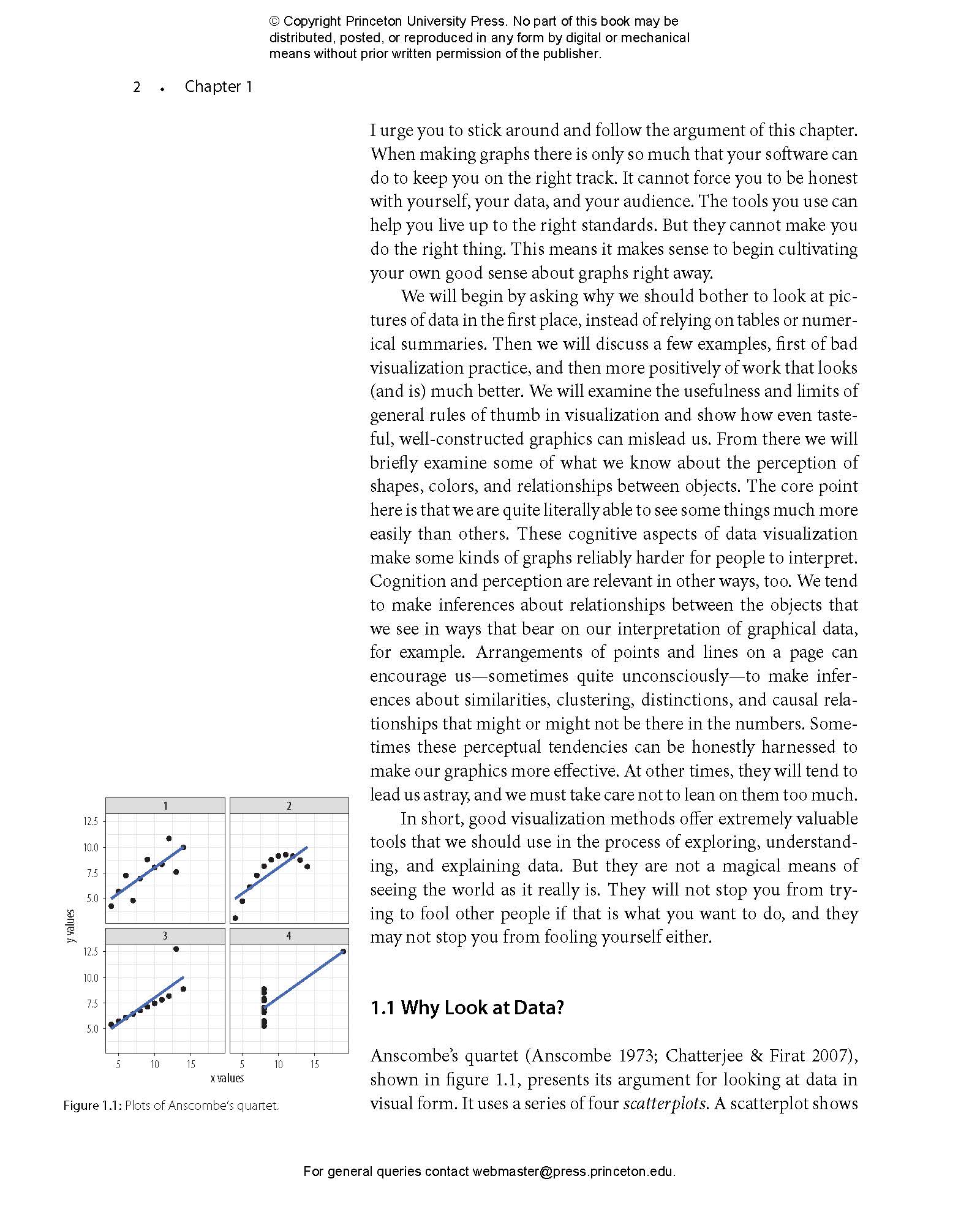
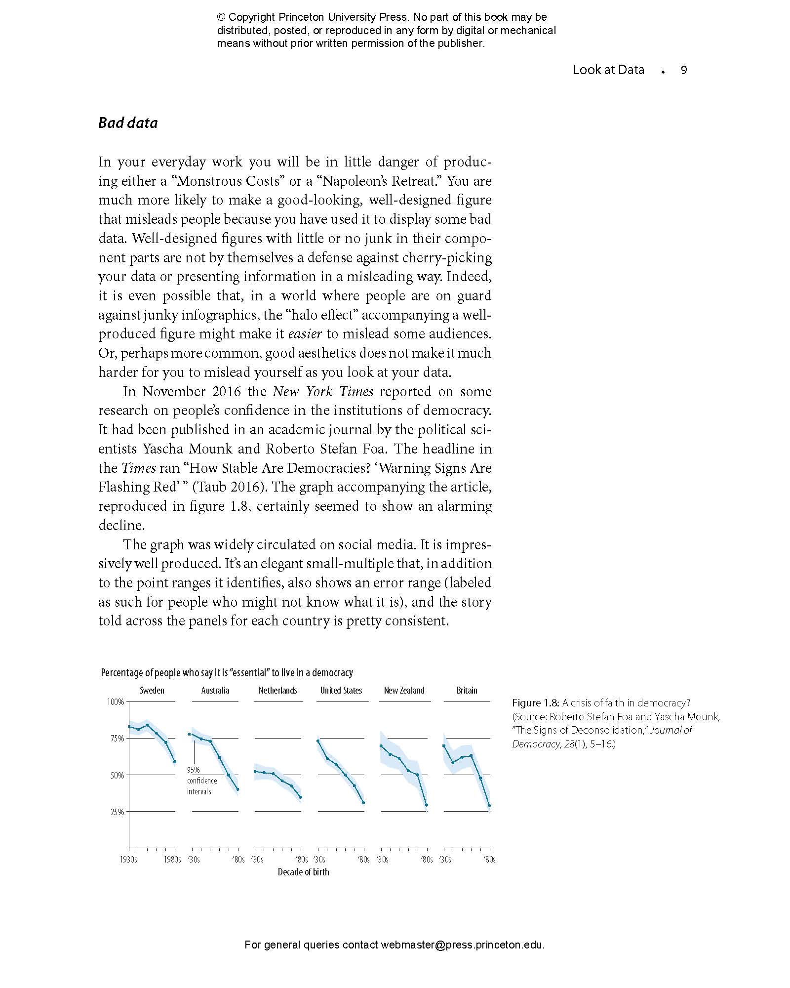
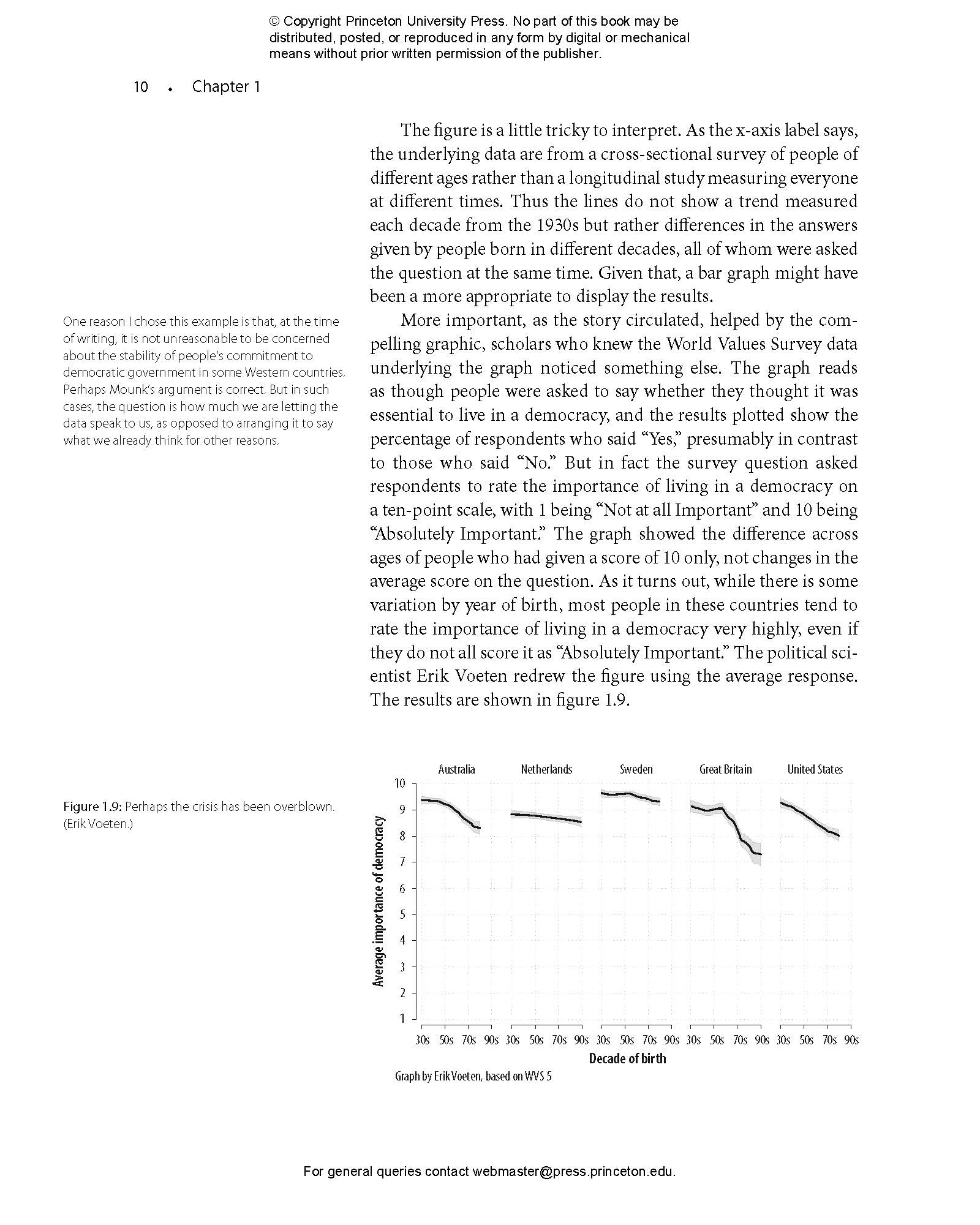
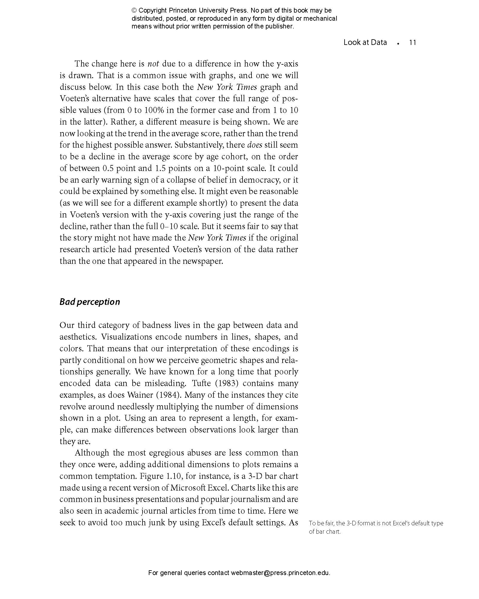
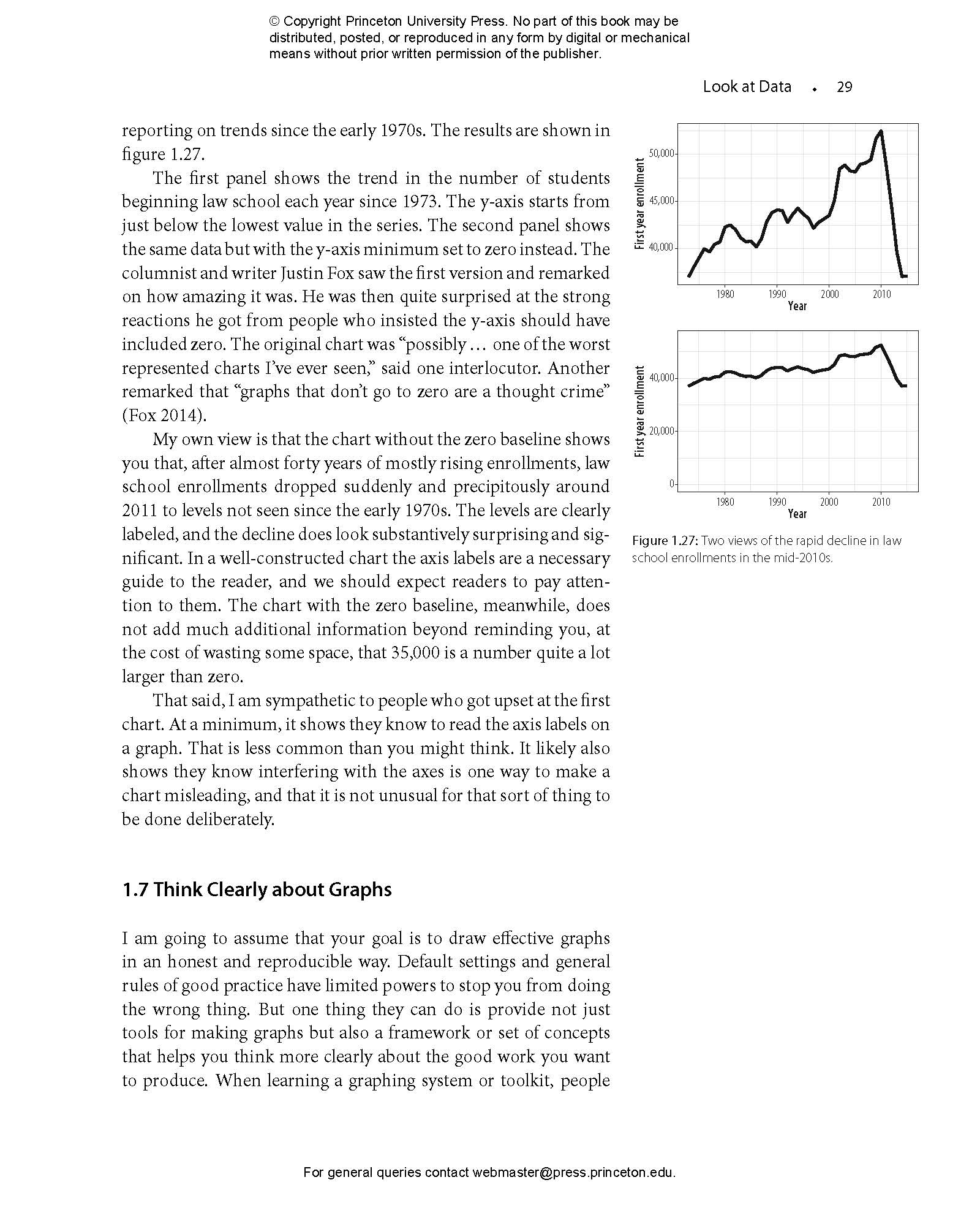
This book provides students and researchers a hands-on introduction to the principles and practice of data visualization. It explains what makes some graphs succeed while others fail, how to make high-quality figures from data using powerful and reproducible methods, and how to think about data visualization in an honest and effective way.
Data Visualization builds the reader’s expertise in ggplot2, a versatile visualization library for the R programming language. Through a series of worked examples, this accessible primer then demonstrates how to create plots piece by piece, beginning with summaries of single variables and moving on to more complex graphics. Topics include plotting continuous and categorical variables; layering information on graphics; producing effective “small multiple” plots; grouping, summarizing, and transforming data for plotting; creating maps; working with the output of statistical models; and refining plots to make them more comprehensible.
Effective graphics are essential to communicating ideas and a great way to better understand data. This book provides the practical skills students and practitioners need to visualize quantitative data and get the most out of their research findings.
- Provides hands-on instruction using R and ggplot2
- Shows how the “tidyverse” of data analysis tools makes working with R easier and more consistent
- Includes a library of data sets, code, and functions
"[Healy’s] prose is engaging and chatty, and the style of instruction is unpretentious and practical . . . This single volume represents an excellent entry point for those wishing to upskill their abilities in data visualization."—Paul Cuffe, IEEE Transactions
"Undoubtedly, this book is an excellent introduction to an essential tool for anyone who needs to collect and present data."—Conservation Biology
“Finally! A data visualization guide that is simultaneously practical and elegant. Healy combines the beauty and insight of Tufte with the concrete helpfulness of Stack Exchange. Data Visualization is brimming with insights into how quantitative analysts can use visualization as a tool for understanding and communication. A must-read for anyone who works with data.”—Elizabeth Bruch, University of Michigan
“Healy’s fun and readable book is unusual in covering the ‘why do’ as well as the ‘how to’ of data visualization, demonstrating how dataviz is a key step in all stages of social science—from theory construction to measurement to modeling and interpretation of analyses—and giving readers the tools to integrate visualization into their own work.”—Andrew Gelman, author of Red State, Blue State, Rich State, Poor State: Why Americans Vote the Way They Do
“Data Visualization is a brilliant book that not only teaches the reader how to visualize data but also carefully considers why data visualization is essential for good social science. The book is broadly relevant, beautifully rendered, and engagingly written. It is easily accessible for students at any level and will be an incredible teaching resource for courses on research methods, statistics, and data visualization. It is packed full of clear-headed and sage insights.”—Becky Pettit, University of Texas at Austin
“Healy provides a unique introduction to the process of visualizing quantitative data, offering a remarkably coherent treatment that will appeal to novices and advanced analysts alike. There is no other book quite like this.”—Thomas J. Leeper, London School of Economics
“Kieran Healy has written a wonderful book that fills an important niche in an increasingly crowded landscape of materials about software in R. Data Visualization is clear, beautifully formatted, and full of careful insights.”—Brandon Stewart, Princeton University
“Healy’s prose is clear and direct. I came away from this book with a much better understanding of both visualizations and R.”—Neal Caren, University of North Carolina, Chapel Hill
“Innovative and extraordinarily well-written.”—Jeremy Freese, Stanford University