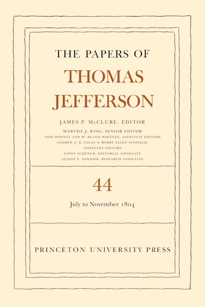
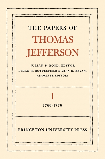
In a ceremony at the Library of Congress on May 17, 1950, President Harry S. Truman accepted the first volume of The Papers of Thomas Jefferson, an ambitious project that would span multiple decades and vastly different modes of production. That first volume galvanized American historical scholarship, renewing interest in the papers of other American political figures and, as its editors have observed, setting new standards for the organization and presentation of historical documents. Seventy years and forty-four volumes later, the Papers are going strong, with the latter-day Retirement Series (sixteen volumes and counting) keeping steady pace.
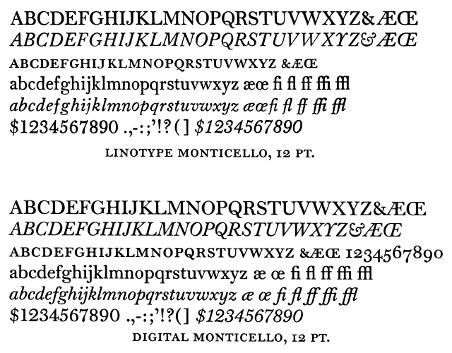
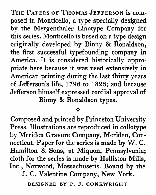
The project was launched in December 1943 at Princeton with a major gift from The New York Times Company, and was soon taken up by Princeton University Press. P. J. Conkwright, the Press’s chief typographer and acclaimed book designer from 1939 to 1970, set about creating the series design, beginning with its bespoke text typeface.* Out of his collaboration with C. H. Griffith of the Mergenthaler Linotype Company came Monticello, a new typeface based on one developed during the last thirty years of Jefferson’s life by America’s first successful type foundry in Philadelphia, Binny & Ronaldson. Originally released for hot metal Linotype setting, Monticello proved sufficiently robust to handle the wide range of typographic demands of the series material, and was stylistically germane to the content. In the digital age, it was once again adapted for new typesetting technology, most recently by Matthew Carter in 2003.
In 1951, the first volume of the Jefferson Papers was selected as one of the Fifty Books of the Year in the prestigious annual book design competition organized by the American Institute of Graphic Arts (AIGA) since 1923. The spare but iconic series design for the Papers has remained intact through two generations and several designers, maintaining a high level of craftsmanship. One of its veteran designers, Jan Lilly, spoke with me about the project.
Jan, you began your career at the Press when the Jefferson series was already quite established. What was it like undertaking a project with some history behind it?
JL: Not as intimidating as you might think; it was a good learning experience. P. J. Conkwright hired me as an apprentice book designer in the late 1960s. By that time, yes, the Jefferson Papers were a known commodity, and they were treated as such in the design and production departments. P. J.’s original design was quite functional—as well as appropriate—and we followed it as closely as possible through numerous changes in technology, procedures, materials, compositors, and suppliers—not to mention staff at PUP. I think it’s weathered well.
Many things did change from the time you started. One of the most significant was the transition from metal Linotype to digital page layout and typesetting.
JL: Yes, precisely. That has been very exciting. But for the most part, everyone involved over the years has maintained the same dedication to editorial, design, and production quality. The series has truly benefited from a sense of continuity. In the grand scheme of things, design and format changes were only made to accommodate content or the availability of materials, and of course, changes in processes—but not fluctuating visual trends. We continued to work closely with the model set by Julian Boyd [former Librarian of Princeton University and first editor of the series] and P. J.
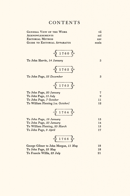
With a project like this whose lifespan can extend indefinitely, it’s inevitable that new material prompts new text specifications. According to Linny Schenck [Editorial Associate for the Papers, former Production Editor at PUP], you had an impeccable eye for laying out these new text elements. She says she fondly remembers your post-it notes to the compositor, always in green pencil, always perceptive in the placement of tables, sketches, running heads. How did you go about spec’ing these to ensure they’d be well integrated with the design of previous volumes?
JL: Linny was wonderful to work with. I also remember those post-it notes fondly! To answer your question, whenever new elements or tricky bits cropped up in the materials, the editorial staff at the University (which collected the material and constructed the “manuscript” for each volume) would tag them and often provide guidance as to size, shape, etc. I would then specify treatment based on past design approaches and style. It was really a collaborative effort to maintain both the aesthetic and the functionality of the original design, and to ensure the quality of each volume. The expertise and professionalism of the University’s editorial team truly went hand in hand with the Press’s. It was really a joy to work with the editors, even with those textual challenges!
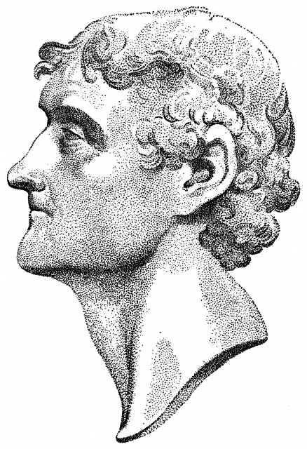
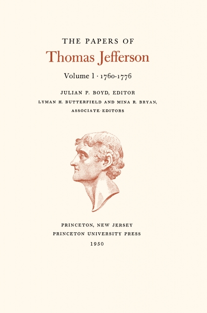
One of those design elements is the stippled bust of Jefferson on the title page of each volume. Do you know who drew it?
JL: I don’t, unfortunately. It looks like some of the collotype textures used for the duotone illustrations which are included in the early volumes. I assume Professor Boyd and P. J. both had some part in the selection—though P. J. had the final word on design.
What about the binding materials and paper stock used nowadays? I imagine these have changed somewhat since the series’ inception. How does the manufacturing match the integrity of those original volumes?
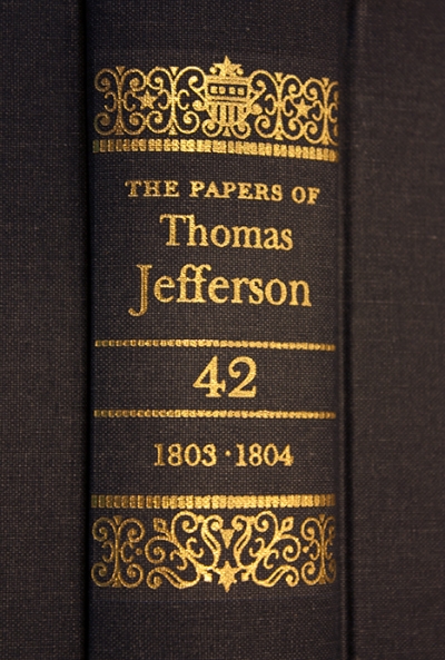
JL: We used to try to preserve the visual elements, like the color of binding material, even when suppliers or the availability of material changed. The main series is now bound in a less hefty buckram than the original, but the color is fairly consistent. At one time, the stamping was genuine gold. The cloth used for the early volumes of the Retirement Series was changed because the first batch faded quite rapidly. The color of the fifth volume on seems to be holding consistently. University and publishing budgets have also gotten a bit tighter, so some compromises have been made, such as going from a heavy, textured buckram to a more economical linen finish. But overall, the University’s editorial staff and the Press still pursue the original goals of completeness, integrity, and lasting quality of materials and design.
You would say they’re adhering to the project originators’ early vision?
JL: I believe so.
Thanks so much for speaking with me, Jan.
JL: Thank you. It was fun to reminisce, and it’s heartening to see the new generation taking such an interest in the series’ history.
Christopher Lapinski is the design coordinator for the Creative Media Lab. Jan Lilly is a retired book designer. She worked for Princeton University Press from 1967 to 2001.
With contributions from Linny Schenck, Editorial Associate for The Papers of Thomas Jefferson, and Chris Ferrante, Senior Designer at Princeton University Press.
Note
* The main text of the series design is set in 10/12 Monticello. Baskerville, Bulmer, and Monticello are used for display elements, such as titles and headings. Stationers Semiscript is used to simulate handwritten calligraphic elements, like signatures. Fournier ornaments are used sparingly for decoration throughout.